|
-- Weekly Market Update for the Week Commencing 22nd November 2010
Big Picture
View
Here is a summary of our big picture
view of the markets. Note that our short-term views may differ from our
big picture view.
In nominal dollar terms, the BULL market in US Treasury Bonds
that began in the early 1980s will end by mid-2010. In real (gold)
terms, bonds commenced a secular BEAR market in 2001 that will continue
until 2014-2020. (Last
update: 09 February 2009)
The stock market, as represented by the S&P500 Index, commenced
a secular BEAR market during the first quarter of 2000, where "secular
bear market" is defined as a long-term downward trend in valuations
(P/E ratios, etc.) and gold-denominated prices. This secular trend will bottom sometime between 2014 and 2020. (Last update: 22 October 2007)
A secular BEAR market in the Dollar
began during the final quarter of 2000 and ended in July of 2008. This
secular bear market will be followed by a multi-year period of range
trading. (Last
update: 09 February 2009)
Gold commenced a
secular bull market relative to all fiat currencies, the CRB Index,
bonds and most stock market indices during 1999-2001. This secular trend will peak sometime between 2014 and 2020. (Last update: 22 October 2007)
Commodities,
as represented by the Continuous Commodity Index (CCI), commenced a
secular BULL market in 2001 in nominal dollar terms. The first major
upward leg in this bull market ended during the first half of 2008, but
a long-term peak won't occur until 2014-2020. In real (gold) terms,
commodities commenced a secular BEAR market in 2001 that will continue
until 2014-2020. (Last
update: 09 February 2009)
Copyright
Reminder
The commentaries that appear at TSI
may not be distributed, in full or in part, without our written permission.
In particular, please note that the posting of extracts from TSI commentaries
at other web sites or providing links to TSI commentaries at other web
sites (for example, at discussion boards) without our written permission
is prohibited.
We reserve the right to immediately
terminate the subscription of any TSI subscriber who distributes the TSI
commentaries without our written permission.
Outlook Summary
Market
|
Short-Term
(0-3 month)
|
Intermediate-Term
(3-12 month)
|
Long-Term
(1-5 Year)
|
Gold
|
Bullish
(27-Oct-10)
|
Bullish
(12-May-08)
|
Bullish
|
US$ (Dollar Index)
|
Neutral
(01-Sep-10)
| Neutral
(27-Sep-10)
|
Neutral
(19-Sep-07)
|
Bonds (US T-Bond)
|
Neutral
(20-Sep-10)
|
Bearish
(14-Dec-09)
|
Bearish
|
Stock Market (S&P500)
|
Neutral
(01-Sep-10)
|
Bearish
(11-Oct-10)
|
Bearish
|
Gold Stocks (HUI)
|
Bullish
(01-Sep-10)
|
Bullish
(23-Jun-10)
|
Bullish
|
| Oil | Neutral
(01-Sep-10)
| Bearish
(01-Mar-10)
| Bullish
|
Industrial Metals (GYX)
| Neutral
(01-Sep-10)
| Bearish
(25-May-09)
| Neutral
(11-Jan-10)
|
Notes:
1. In those cases where we have been able to identify the commentary in
which the most recent outlook change occurred we've put the date of the
commentary below the current outlook.
2. "Neutral", in the above table, means that we either don't have a
firm opinion or that we think risk and reward are roughly in balance with respect to the timeframe in question.
3. Long-term views are determined almost completely by fundamentals,
intermediate-term views by giving an approximately equal weighting to
fundamental and technical factors, and short-term views almost
completely by technicals.
Wealth Creation
Here is a link to a video
that explains, in simple terms, why increased government spending
cannot possibly help the economy.
http://www.youtube.com/watch?v=Yi2l0NilEBE
Climate Change (formerly known as "Global Warming", probably soon to be known as "Climate Disruption")
Whenever
we mention this topic we always manage to antagonise some of our
readers, so it is with some consternation that we are revisiting it
now. We feel compelled to revisit it from time to time because rather
than "climate change" being what it should be, which is something to be
analysed and debated by impartial scientists whose only goal is
determining the truth, it has been totally politicised. Unfortunately,
the science is being 'pushed' in a certain direction in order to
justify policies that will have far-reaching effects on economies and
markets.
We are Anthropogenic Global Warming (AGW) sceptics, not because we have
an inbuilt bias against the theory but because the evidence just
doesn't support it. Furthermore, the more information we gather the
more sceptical we become. Just to be clear, there is no question that
humans have caused the global CO2 level to increase and that a higher
level of CO2 will make some contribution to a higher average
temperature via the "greenhouse effect", but there are serious
questions about the EXTENT to which human-generated CO2 has affected
the global temperature and about the models that have been produced by
the AGW proponents in an effort to 'prove' their case. There is also an
'Orwellian' quality to the way the pro-AGW climate establishment have
changed historical records to match their theories and predictions.
Some of our reasons for being sceptical are listed below, but this list
is far from comprehensive. If you are looking for a more detailed
discussion of the reasons to be sceptical then we suggest you start by
reading the document linked HERE.
Reasons to question the conclusion that human-generated CO2 emissions have led to significant global warming:
1) More than 80% of thermometers in the official global network are in
urban areas or at airports, which are unnaturally warm localities (the
annual average air temperature of a city with 1 million people can be
1ñ3?C warmer than its surroundings). This means that the warming
measured by many of the official thermometers probably has a lot more
to do with localised urbanisation than global climate change.
2) The National Oceanic and Atmospheric Administration (NOAA) in the
USA has begun to address the thermometer location issue by adding
properly-located thermometers and removing poorly-located ones, but new
data will take decades to accumulate and in the mean time conclusions
are being reached, and policies concocted, based on the data from the
poorly located thermometers.
3) Thermometer-based data suggest that the global upward trend in
temperature continued until at least 2006, but temperature measurements
taken by satellites, which are more reliable indicators of average
surface temperature, suggest that the most recent warming trend ended
in 1998 (note: the world is always in either a warming trend or a
cooling trend; that is, the climate is always changing).
4) Dr. Phil Jones, Director of the Climate Research Unit (CRU) at the
University of East Anglia in the UK and one of the leading supporters
of the AGW theory, admitted in a BBC interview early this year that
there has been no statistically-significant global warming since 1995
and that the world has probably been cooling since 2002.
5) Over the past 150 years, a period in which there is considerable
data regarding CO2 levels and temperature levels (putting aside the
fact that temperature measurements have been skewed to the upside by
the thermometer location issue mentioned above), temperature has
experienced multi-decade upward and downward trends independently of
CO2 levels.
6) Ice data suggest that over extremely long periods (thousands of
years), the average CO2 level FOLLOWS the average temperature. That is,
if there is an ultra-long-term cause-effect relationship then a higher
temperature is the cause and a higher CO2 level is the effect. This was
well known when Al Gore made his "Inconvenient Truth" film, but Gore
presented the information in a way that made it seem as if CO2 was
leading and temperature was following. This was a shameless attempt to
mislead.
7) The "Climategate" emails showed that official temperature data had
been manipulated and destroyed, and that requests for information made
under the "Freedom of Information Act" had been ignored, in an effort
to promote the AGW theory and suppress evidence to the contrary.
8) Up until the late 1990s, the historical temperature record accepted
by almost all climate scientists indicated that during the period from
around 1000 AD to 1300 AD the Earth's average temperature was
significantly higher than at any other time over the past two
millennia, including the current time. This period of global warmth is
known as the "Medieval Warm Period" (MWP). The historical record was
therefore inconsistent with the AGW Theory. However, rather than change
or even question the theory, the Western climate establishment chose to
change the historical record. This is why the now-famous "hockey stick"
temperature graph (the Hockey Stick model developed by Michael Mann)
came into existence at the beginning of the 2000s. The Hockey Stick
model conveniently eliminated both the MWP of 1000-1300 and the "Little
Ice Age" of 1500-1700, even though there is a mountain of evidence to
confirm the temperature extremes of both periods. Note that the "Little
Ice Age" had to be eliminated from the historical record -- even though
there is no doubt that it actually occurred -- because if it had
remained then it would be clear that the current warming trend began
about 150 years prior to the Industrial Revolution. In other words, it
would be clear that the first half of the current warming trend
occurred before humans began to make any measurable contribution to the
amount of CO2 in the atmosphere.
9) The statistical techniques employed by Michael Mann will tend to
generate an output that looks like a hockey stick (a long, straight
"handle" with a sharp, upward-sloping "blade" at the end), almost
regardless of the data. In other words, his methodology was designed to
produce a "hockey stick", so that's what he ended up with. Eminent
statisticians have explained that Mann's methods were fatally flawed.
10) In the interview mentioned in Point 4) above, Dr. Phil Jones agreed
that the Northern Hemisphere experienced a Medieval Warm Period (MWP)
and that the Earth could have been warmer during that period than it is
today. This is a tacit admission by one of the world's foremost AGW
proponents that the "hockey stick" model is probably wrong.
11) Despite the above, many pro-AGW web sites still display "hockey
stick" temperature charts as if they were based on fact rather than on
unreliable/biased statistical techniques. Consequently, many members of
the general public still believe that the recent warming of the planet
is unprecedented.
12) The way the world has heated up during the most recent warming
trend does not match the way it would have heated up if the trend were
being driven by an increase in atmospheric CO2. This is explained on
pages 30-34 of the above-linked document.
Uranium
Regardless of whether or not human-generated CO2 emissions are causing
a worrisome increase in global temperature, the cleanest methods of
large-scale power generation should be favoured as long as these
methods are economically viable. At this time, uranium-fueled (nuclear)
power generation is the ONLY economically-viable alternative to the
large-scale generation of power via the burning of fossil fuels.
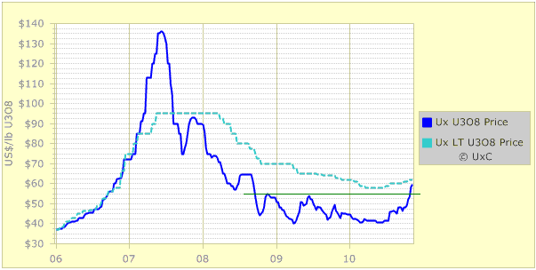
There has been a major change in uranium-related sentiment over the
past three months, leading to an upside breakout in the uranium price
(see chart below) and large gains in uranium-mining equities. The
catalyst for the change was evidence that China's consumption of
uranium was set to ramp up over the years ahead. In particular,
sentiment was given a hefty boost by news that China's government had
raised its 2020 nuclear power generation target by 60%.
It is often the case
that markets take a lot longer than we expect to react to an important
change in the fundamentals, and then, when they do finally take notice,
move much more quickly than we expect. The uranium market's performance
is a good example, in that it has been apparent for at least 18 months
that both China and India were about to step-up their uranium
purchases. We pointed to the increasing uranium demand of China and
India in TSI commentaries last year, but the financial markets turned a
blind eye to this and other positive developments. It wasn't until July
of this year that sentiment began to turn around. And then, all of a
sudden, everyone was wildly bullish on uranium.
Until recently there were two uranium-mining stocks in the TSI List:
Uranium One (UUU.TO), a mid-tier producer, and Energy Fuels (EFR.TO), a
small development-stage company. However, we removed UUU a couple of
weeks ago after it moved well above our estimate of full value, leaving
EFR as our sole exposure. EFR is one of a very small number of uranium
juniors that stands a reasonable chance of making money from the actual
mining of uranium (the vast majority will never produce any uranium),
and is, we think, one of the best speculative plays on uranium. It is
risky, but it has very high reward potential.
We have been searching for other opportunities within the uranium
sector, but at this stage the stocks that have what we want in terms of
assets are too expensive to buy. For example, we like Uranerz Energy
(URZ) and Hathor Exploration (HAT.TO), but we wouldn't buy them at
current prices. In our opinion, these stocks would be good speculations
at 20-30% discounts to current prices.
A simple way to obtain exposure to a basket of uranium mining stocks is
to buy the Global Uranium Fund (TSX: GUR). As evidenced by the list of
GUR's holdings presented HERE, this fund covers the uranium mining gamut -- from the world's largest producer (Cameco) to exploration-stage minnows.
We suggested scaling into GUR a few times between September of last
year and July of this year in the C$2.00-$2.40 range. It ended Friday's
session at C$3.45 and would probably be suitable for new buying if it
dropped to the high-C$2 area, but be aware that GUR is quite illiquid.
This makes it difficult to trade in size and can magnify its volatility.
Another option for investors looking for a simple way to obtain
broad-based exposure to uranium stocks is the newly-listed Global X
Uranium ETF (NYSE: URA). URA's holdings
are similar to those of GUR, but it could prove to be a more liquid
security and could therefore be easier to trade. A decline of 15-20%
from Friday's closing price of US$17.73 would constitute a buying
opportunity.
Note that instead of waiting for specific price levels to be reached,
investors wanting to bulk-up their exposure to uranium stocks could
simply average into URA and/or GUR.TO on weakness over the next 12
months.
The Stock
Market
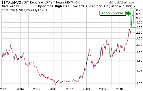
The Topping Process
In the most recent two TSI reports we pointed to a few signs that a
major trend change was possibly in the works. We are referring to the
impressive downward reversals in the Shanghai stock market, some
commodities (most notably cotton and platinum), and the US municipal
bond market. Another potential sign of a major change is the downward
reversal in the TYX/FVX ratio (the 30-year yield divided by the 5-year
yield) depicted below.
Prior to this year, TYX/FVX generally trended inversely to global
growth and liquidity, meaning that it tended to rise when growth
expectations and market liquidity were declining, but this year's
performance has been the complete opposite of what normally occurs. We
suspect that this year's dramatic change in TYX/FVX's behaviour is due
to the Fed's aggressive manipulation of interest rates. By holding the
official short-term interest rate near zero in the face of rising
nominal economic growth, the Fed caused the yield curve to become
steeper at a time when it should have been flattening.
We hasten to add,
however, that not all the signs that we would expect to see around the
time of a major trend change have yet been seen. Chief among the
missing signs are a downward reversal in the silver/gold ratio
(discussed later in today's report) and a significant widening of
credit spreads. If a topping of the 2009-2010 recovery is underway,
then these other signs should appear within the next two months.
Current Market Situation
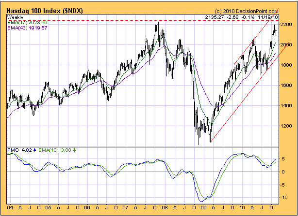
Here is a weekly chart of the NASDAQ100 Index (NDX), courtesy of
DecisionPoint.com. The oscillator at the bottom of the chart shows that
the NDX's momentum peaked at the beginning of this year, even though
the price continued its upward trend and recently challenged the 2007
peak.
Does the above chart reflect a huge 'double top' in the making?
It could, but it is just as likely that the NDX will move above its
2007 peak before commencing its next intermediate-term decline. Either
way, we don't like the intermediate-term risk/reward.
This week's
important US economic events
| Date |
Description |
Monday Nov 22
| No important events scheduled
| | Tuesday Nov 23 | Q3 GDP (revised)
FOMC Minutes
Existing Home Sales
| | Wednesday Nov 24
| Durable Goods Orders
Personal Income and Spending
Consumer Sentiment
New Home Sales
| | Thursday Nov 25
| US markets closed for Thanksgiving
| | Friday Nov 26
| No important events scheduled
|
Gold and
the Dollar
Gold
Below is an updated version of the chart we included in the 18th
October Weekly Update. The chart illustrates the positive correlation
between the gold price and the SPX/BKX ratio (the broad stock market
relative to the banking sector); in other words, it shows that gold
tends to do well when the banking sector of the stock market is
relatively weak. This relationship comes about because confidence in
the monetary system and the financial establishment (the central bank
and the commercial banks) is always an important intermediate-term
driver of the gold price.
Note that the only significant divergence between gold and SPX/BKX
evident on the chart occurred during February-May of this year, when
Europe's government debt crisis overwhelmed all other influences on the
gold market.
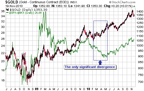
As mentioned in our
18th October commentary, the message of the above chart is that the
gold price won't experience anything more serious than a routine
short-term correction as long as the banking sector remains weak
relative to the broad stock market. At this stage there is no evidence
that the banking sector's relative strength has turned the corner,
which supports our opinion that gold will make new highs within the
next couple of months.
Moving along, in a recent commentary we said that as far as the
financial markets' current situation and short-term prospects are
concerned, the weekly chart of the silver/gold ratio is probably the
most important chart in the world right now. An updated version of this
chart is displayed below.
A lot of things happened in the markets over the past two weeks, but
one thing that didn't happen was a downward reversal in the silver/gold
ratio. The ratio is sufficiently 'overbought' to create a major top,
but there is no sign that a top is already in place. Once a top is put
in place it should quickly be confirmed by an obvious reversal on the
weekly chart.
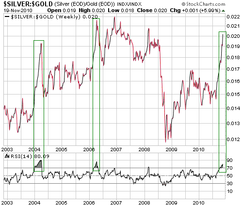
The silver/gold ratio
suggests that a) gold and silver haven't yet reached price peaks that
will hold for more than a few weeks, and b) important peaks will very
likely be put in place within the next two months.
Gold Stocks
The HUI bounced after reaching support in the 520s. It could easily
drop back to test last week's low within the next several days and
could make a slightly lower low, but we don't expect it to move much
lower than 520 on a daily closing basis. One reason is that a decisive
move below 520 would be inconsistent with the recent upside breakout in
the HUI/gold ratio. Another reason is that the HUI's recent breakouts
above the tops of intermediate-term and long-term bases point to a lot
more upside than we've seen to date.
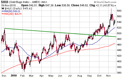
The gold sector's
risk/reward appears to be skewed towards reward over every timeframe
from a few weeks to a few years, but one thing that does concern us is
the HUI's tendency to reach an intermediate-term extreme between early
November and the first two trading days of December. In other words, we
are in the midst of a multi-week time window when important turning
points have often occurred in the past. At this stage we don't think
that the 9th November downward reversal created a peak that will stand
for more than a few more weeks, but the fact that it occurred within
the turning-point window prompts us to be more cautious than we would
otherwise be.
Note that even if intermediate-term peaks are already in place for
gold-stock indices such as the HUI and the XAU, many junior gold/silver
stocks will probably go on to make new 52-week highs during the first
few months of next year.
Currency Market Update
The currency market was essentially flat last week, with the US$ rising
during the first two days as stocks/commodities fell and then giving up
its gains as stocks/commodities rebounded. A result, as illustrated by
the following daily chart, is that the euro dropped to its
intermediate-term channel bottom during the first half of the week and
then rose to end the week just below short-term resistance.
Both of the euro scenarios described in the 15th November Weekly Update
are still in play, with approximately equal odds. Specifically, it is
possible that the euro has just completed (or is about to complete) a
4-5 week consolidation and will soon commence the final upward leg of
the intermediate-term advance that began in June, and it is also
possible that the euro has just completed (or is about to complete) the
first downward leg of a new intermediate-term decline. A daily close
below 1.34 would shift the odds decidedly in favour of the latter
scenario.
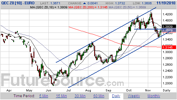
It is apparent that
the currency market continues to be driven by what's happening in the
growth-oriented markets (the stock and commodity markets), with the US$
strengthening in response to stock/commodity weakness and weakening in
response to stock/commodity strength. This relationship is often not
evident on a daily basis, but it is clearly the dominant influence on
an overall trend basis. For example, the euro rebounded during the
second half of last week in response to a euro-bearish fundamental
development (the potential for more euro inflation as part of a bailout
of Ireland's government) because this euro-bearish development boosted
the short-term outlook for stocks and commodities.
Update
on Stock Selections
(Notes: 1) To review the complete list of current TSI stock selections, logon at http://www.speculative-investor.com/new/market_logon.asp
and then click on "Stock Selections" in the menu. When at the Stock
Selections page, click on a stock's symbol to bring-up an archive of
our comments on the stock in question. 2) The Small Stock Watch List is
located at http://www.speculative-investor.com/new/smallstockwatch.html)
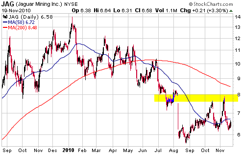
 Jaguar Mining (NYSE and TSX: JAG). Shares: 84M issued, 88M fully diluted. Recent price: US$6.58 Jaguar Mining (NYSE and TSX: JAG). Shares: 84M issued, 88M fully diluted. Recent price: US$6.58
The stock market seemed to react negatively to the Q3 financial report
issued by JAG during the week before last, but as far as we can tell
there was no new information of significance in this report. The
important information (Q3 production and costs, and production guidance
for Q4 and 2011) had been issued by the company about three weeks
earlier in its 20th October press release.
The steps that are being taken by JAG's management to address the
production problems at its Brazil-based Turmalina and PaciAancia mines
probably won't start 'bearing fruit' until the first quarter of next
year, so we aren't expecting any positive developments in the near
future. The bullish case is simply that the stock is very under-valued
assuming that these problems will be rectified by early next year,
enabling the company to meet its current 2011 production target of 225K
ounces. There is a good chance that JAG will grow its production well
beyond the 225K-oz/yr rate within the next few years, but we are
allowing nothing for this growth potential.
Based only on JAG achieving a steady state production rate of 225K
ounces/year, a valuation in the US$10-$11 range looks achievable
assuming a gold price in excess of $1200/oz. $10-$11 is also the
chart-based target that would be created by a break above resistance at
$7.50-$8.00.
Copper Fox (TSXV: CUU). Shares: 367M issued, 378M fully diluted (incl. Nov-2010 financing). Recent price: C$0.76
CUU announced last week that it was delaying a planned resource
re-estimation for its Schaft Creek copper/gold project until the first
quarter of next year to enable new exploration data to be incorporated
into the re-estimate. There was no mention in the press release of a
revised completion date for the Feasibility Study (FS), but we assume
that completion of the FS has also been pushed into the first quarter
of 2011. Completion of the FS is a critical milestone for CUU because
it starts the meter running on Teck's right to claw back 75% of the
Schaft Creek project.
Following its spectacular August-September run-up, CUU's stock price
has drifted sideways. The chart looks bullish, but the delays to the
completion of the FS increase the risk. The longer it takes to complete
the FS, the greater the chance that the copper price will tank before
Teck is required to make a decision on how to proceed with the project
(the higher the copper price, the more likely it is that Teck will
decide to buy-out its junior partner following completion of the FS).
We continue to think that CUU stands a good chance of trading above C$1
in early 2011 in response to FS-related and takeover-related
speculation, but we wouldn't do any new buying at this time and would
only be comfortable retaining a small position. A decline to the
vicinity of the 200-day moving average would greatly improve the
risk/reward and create a new buying opportunity, but there is no sign
in the chart that a decline of this magnitude is likely.
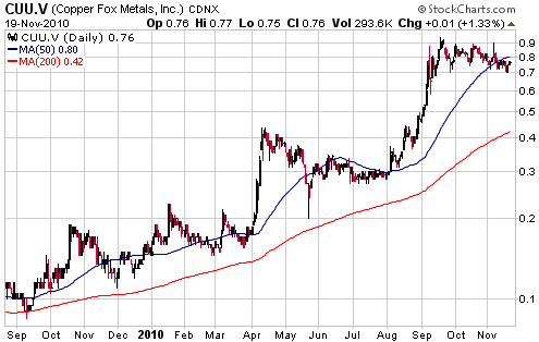
Chart Sources
Charts appearing in today's commentary
are courtesy of:
http://stockcharts.com/index.html
http://www.futuresource.com/
http://www.decisionpoint.com/

|