|
-- Weekly Market Update for the Week Commencing 23rd May 2011
Big Picture
View
Here is a summary of our big picture
view of the markets. Note that our short-term views may differ from our
big picture view.
In nominal dollar terms, the BULL market in US Treasury Bonds
that began in the early 1980s ended in December of 2008. In real (gold)
terms, bonds commenced a secular BEAR market in 2001 that will continue
until 2014-2020. (Last
update: 4 April 2011)
The stock market, as represented by the S&P500 Index, commenced
a secular BEAR market during the first quarter of 2000, where "secular
bear market" is defined as a long-term downward trend in valuations
(P/E ratios, etc.) and gold-denominated prices. This secular trend will bottom sometime between 2014 and 2020. (Last update: 22 October 2007)
A secular BEAR market in the Dollar
began during the final quarter of 2000 and ended in July of 2008. This
secular bear market will be followed by a multi-year period of range
trading. (Last
update: 09 February 2009)
Gold commenced a
secular bull market relative to all fiat currencies, the CRB Index,
bonds and most stock market indices during 1999-2001. This secular trend will peak sometime between 2014 and 2020. (Last update: 22 October 2007)
Commodities,
as represented by the Continuous Commodity Index (CCI), commenced a
secular BULL market in 2001 in nominal dollar terms. The first major
upward leg in this bull market ended during the first half of 2008, but
a long-term peak won't occur until 2014-2020. In real (gold) terms,
commodities commenced a secular BEAR market in 2001 that will continue
until 2014-2020. (Last
update: 09 February 2009)
Copyright
Reminder
The commentaries that appear at TSI
may not be distributed, in full or in part, without our written permission.
In particular, please note that the posting of extracts from TSI commentaries
at other web sites or providing links to TSI commentaries at other web
sites (for example, at discussion boards) without our written permission
is prohibited.
We reserve the right to immediately
terminate the subscription of any TSI subscriber who distributes the TSI
commentaries without our written permission.
Outlook Summary
Market
|
Short-Term
(0-3 month)
|
Intermediate-Term
(3-12 month)
|
Long-Term
(1-5 Year)
|
Gold
|
Neutral
(19-Apr-11)
|
Neutral
(24-Jan-11)
|
Bullish
|
US$ (Dollar Index)
|
Neutral
(07-Mar-11)
| Bullish
(02-May-11)
|
Neutral
(19-Sep-07)
|
Bonds (US T-Bond)
|
Neutral
(20-Sep-10)
|
Bearish
(21-Mar-11)
|
Bearish
|
Stock Market (S&P500)
|
Bearish
(09-May-11)
|
Bearish
(11-Oct-10)
|
Bearish
|
Gold Stocks (HUI)
|
Neutral
(24-Apr-11)
|
Bullish
(23-Jun-10)
|
Bullish
|
| Oil | Neutral
(31-Jan-11)
| Neutral
(31-Jan-11)
| Bullish
|
Industrial Metals (GYX)
| Bearish
(03-Jan-11)
| Bearish
(25-May-09)
| Neutral
(11-Jan-10)
|
Notes:
1. In those cases where we have been able to identify the commentary in
which the most recent outlook change occurred we've put the date of the
commentary below the current outlook.
2. "Neutral", in the above table, means that we either don't have a
firm opinion or that we think risk and reward are roughly in balance with respect to the timeframe in question.
3. Long-term views are determined almost completely by fundamentals,
intermediate-term views by giving an approximately equal weighting to
fundamental and technical factors, and short-term views almost
completely by technicals.
Why do bad economic theories persist?
Ludwig von Mises and
Friedrich Hayek, the most prominent "Austrian" economists of the time,
anticipated the 1929 stock market crash and correctly predicted the
dire consequences of government attempts to artificially stimulate
economic growth in the aftermath of the crash. John Maynard Keynes, on
the other hand, was totally blindsided by the stock market crash and
the economic disaster of the early 1930s. And yet, Keynes's theories
gained enormous popularity during the 1930s whereas the work of Mises
and Hayek was largely ignored. Why was it so?
As far as we can tell, Keynes became popular because he told the
politically powerful what they wanted to hear. In particular, he
provided power-hungry politicians with intellectual support for the
schemes they already had in mind. Despite being riddled with logical
errors, Keynes' theories also appealed to many economists because the
implementation of these theories would confer a lot more influence to
the economics fraternity. The fact is that in a genuinely free economy
there wouldn't be much for an economist to do other than teach
economics. He/she would certainly never have the opportunity to be
involved in the 'management' of the economy.
The points outlined in the above paragraph, along with Keynes' charisma
and salesmanship, explain why "Keynesian" economic theories became
popular, but it doesn't explain how they managed to stay popular in the
face of an ever-growing mountain of evidence indicating that they
result in long-term economic decline.
In our opinion, the theories have stayed popular for two main reasons.
First, not only do they mesh with the personal goals of almost all
current politicians, but also there is now a huge government apparatus
in place that depends upon the continued application of these theories.
In other words, a large chunk of the population now has a vested
interest in perpetuating the myth that the government should 'manage'
the economy. Second, it usually isn't possible to disprove an economic
theory using data, because the data can usually be interpreted in many
different ways. On a related point, in economics you can't run the same
experiment multiple times to see how changing some variables will
affect other variables, because every experiment only occurs once (it
isn't possible to go back in time and repeat history to see what would
have happened if different policies had been implemented). The bottom
line is that in the science of economics, you need to start with the
correct theory in order to correctly interpret the data.
A good example of how the same data can be interpreted in different
ways in order to support conflicting theories is provided by the
1937-1939 collapse of the US economy. According to the "Austrians", the
fact that the US federal government propped up prices, drastically
increased its spending, inflated the money supply, began interfering
with many industries and generally did whatever it could to prevent the
corrective process from running its course following the 1929 stock
market crash guaranteed that all signs of economic recovery would
quickly disappear as soon as the artificial support was wound back. The
mistake, according to the "Austrians", was to provide the artificial
support. According to the "Keynesians", however, the mistake was to
remove the artificial support prematurely. They argue that the
government and the Fed should have continued to do whatever was needed
to postpone a collapse, the idea being that with enough government
assistance in the form of new money, new regulations, handouts, price
controls and job-creating public works projects the economy would
eventually gain enough strength to become self-supporting.
In terms of being open to very different interpretations, the US
economy's performance during 1937-1939 is typical. Unfortunately, when
throwing more government spending, more credit and more monetary
inflation at an economic downturn doesn't lead to a self-sustaining
recovery, the followers of Keynes will always be able to assert that it
would have worked if only it had been done more aggressively or over a
longer period.
Interesting quotes
The following was included in John Hussman's 16th May weekly commentary:
"...for the 20 years
ended in 2008, the Dow Jones Total Stock Market Index averaged an
annual total return of 8.3%, the average equity fund returned 7.3%, but
the average fund investor only achieved a return of 1.9% annually
because of the tendency to chase investments at their peaks and bail
out during weak periods."
The public generally likes to buy the investments that have performed
well in the recent past. The thinking, obviously, is that what has
worked well will continue to work well, but this line of thinking is
often wrong because substantial out-performance generally diminishes
the likely future return. Furthermore, even with the tailwind of a
long-term bull market at his back an investor can achieve sub-par
performance by doing most of his buying following large short-term
price advances.
The next quote is from Robert Murphy's 16th May article, which was inspired by billionaire Raj Rajaratnam's recent "insider trading" conviction:
"Although the public
generally loves the fall of a ruthless and greedy financial titan --
this, of course, is what made Oliver Stone's original Wall Street such
a hit -- economists have argued for decades that the practice of
"insider trading" can actually be beneficial. In practice, the
government can use the amorphous "crime" to go after any successful
trader it wants. In a free society, there would be no such thing as
laws against so-called insider trading."
These days, many actions are illegal but not unethical, while many
other actions are unethical but not illegal. For example, "insider
trading" does not involve the violation of anyone's property rights and
is therefore not unethical, except in cases where the person doing the
trading or sharing the inside information is breaking a contract.
However, the government has made it illegal. Furthermore, it is illegal
in an arbitrary way in that the government gets to pick and choose
which traders are charged and which ones are left alone. Wire-tapping,
on the other hand, is a blatant violation of property rights and is
therefore unethical, and yet it is legal for the government to do it.
The Stock
Market
The 10-day moving average of
the OEX (S&P100) put/call ratio shows that the "smart money"
(professional hedgers) still has an unusually high level of concern
about downside risk in the US stock market. In fact, the OEX put/call
situation indicates that the past 5 months is the longest period of
sustained bearishness by professional hedgers ever (or, at least, as
far back as put/call records go). However, the 10-day moving average of
the equity put/call ratio shows that the "dumb money" (the public) has
recently become a lot less optimistic. This is a minor positive.
Our view is that the US stock market stands a good chance of moving to
a new high for the year within the next few weeks, but very little
chance of making large additional gains. In our opinion, the next
10-20% in the senior stock indices will be to the downside.
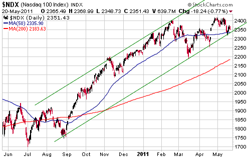
With reference to the following daily chart of the NASDAQ100 Index
(NDX), we think it is reasonable to draw a 'line in the sand' just
below last week's low. Let's say, at 2300 for the NDX. As long as this
'line in the sand' is not breached we will assume that new highs lie
ahead, but if the market closes below this line then we will conclude
that an intermediate-term peak is in place.
This week's
important US economic events
| Date |
Description |
Monday May 23
| No important events scheduled
| | Tuesday May 24 | New Home Sales
| | Wednesday May 25
| Durable Goods Orders
| | Thursday May 26
| Q1 GDP
| | Friday May 27
| Personal Income and Spending
Consumer Sentiment
Pending Home Sales
|
Gold and
the Dollar
Gold and Silver
What should the gold/silver ratio be?
The price of gold is dominated by investment/monetary demand to such an
extent that nothing else matters as far as gold's intermediate- and
long-term price performance is concerned. Investment/monetary demand is
probably also the most important driver of silver's price trend,
although in silver's case industrial demand is also important. In
addition, changes in mine supply have some effect on the silver market,
because unlike the situation in the gold market the annual supply of
newly-mined silver is not trivial relative to the existing aboveground
supply of the metal.
Given that the change in annual mine supply is irrelevant to the gold
price and is not close to being the most important driver of the silver
price, why do some analysts argue that the gold/silver ratio should
reflect the relative rarities of the two metals in the ground? We don't
know, but it isn't a valid argument.
Another popular argument that we think is invalid is that the
gold/silver ratio should be around 16:1 because that's what it was for
hundreds of years prior to the last hundred years. The fact is that due
to changes in technology and changes in the monetary system, permanent
changes occur in the relative values of different commodities and
different investments. For example, when monetary inflation was
constrained by the Gold Standard the stock market's average dividend
yield was always higher than the average yield on long-dated bonds, but
the 1934-1971 phasing-out of the official link to gold permanently
altered this relationship. In a world where governments and central
banks can and do inflate at will, the stock market will almost always
yield less than the bond market because stocks have some built-in
protection against inflation. The point we are trying to make is that
the ratio of gold and silver during an historical period in which both
metals were officially "money" does not tell us what the ratio should
be now that neither metal is officially money and one of the metals
(silver) has an important industrial demand component.
The global monetary system's current configuration dates back to the
early 1970s, when the last remaining official link between gold and the
US$ was severed. This probably means that we can look at how gold and
silver have performed relative to each other since the early 1970s to
determine what's normal and what's possible. With reference to the
following chart, here's a summary of what happened during this period:
a) The gold/silver ratio spent the bulk of the 1970s in the 30-40
range, but broke out of this range to the downside during the second
half of 1979 in response to massive accumulation of silver bullion and
silver futures by the Hunt brothers.
b) The ratio dropped as low as 16:1 in January of 1980, but then
returned to 40 in the 'blink of an eye' as rule changes by the
commodity exchange created financial problems for the highly-geared
Hunts.
c) During the second half of the 1980s the ratio trended upward as US
financial corporations weakened. The ratio peaked at around 100 at the
beginning of 1990s in parallel with a full-blown banking crisis that
almost resulted in the collapse of some of the US's largest banks.
d) The ratio trended lower throughout the 1990s as the banks recovered
(with the help of the Fed) and financial assets trended upward.
e) From the late 1990s through to the beginning of this year the ratio
oscillated between 45 and 80, with 80 being reached near the peaks of
financial crises (early-2003 and late-2008) and 45 being reached in
response to generally high levels of economic confidence.
f) In February of this year the ratio broke below the bottom of its
long-term range and rapidly moved down to around 30. The huge price
run-up in silver that led to this large/fast decline in the gold/silver
ratio was fueled by the overt bullishness of a very well-heeled
speculator (Eric Sprott) and by various rumours, including rumours of
silver shortages and the unwinding of a price-suppression scheme led by
JP Morgan.
g) The 2010-2011 parabolic advance in the silver price ended the same
way that every similar episode in world history ended -- with a price
collapse. The ratio has since moved back above 40.
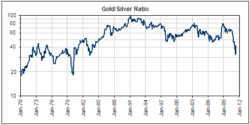
The gold/silver
ratio's performance over the past four decades suggests that the 40-55
range can now be considered normal, with moves well beyond the top of
this range requiring a financial crisis and/or major problems within
the banking industry and moves well beyond the bottom of this range
requiring rampant speculation focused on silver.
Current Market Situation
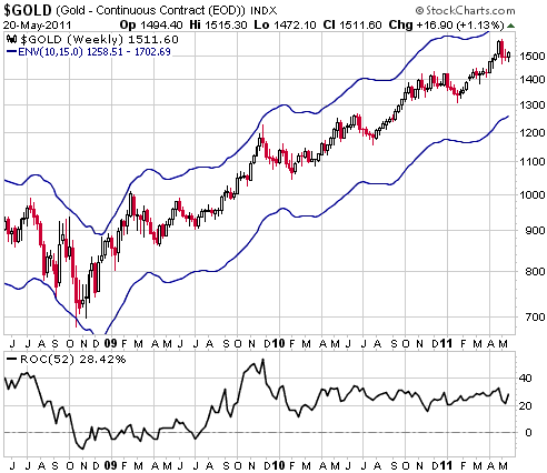
Below is a weekly gold chart with a moving average envelope defined by
the 10-week moving average (MA) plus/minus 15%. The bottom section of
the chart shows gold's 52-week rate of change (ROC).
We want to use this chart to make two related points:
First, the ROC indicator shows that at no time over the past 12 months
has the US$ gold price been up by more than 35% on a year-over-year
basis. This is absolutely not what we'd expect to see if gold were in
the process of making a major top, in that major tops in the commodity
markets typically follow year-over-year gains of 100% or more. However,
note that silver's 52-week ROC reached 150% during April, which, as far
as we know, is the highest year-over-year percentage gain achieved by
any commodity with a liquid futures market over the past 10 years.
This, and not some nefarious manipulation scheme, is why the silver
market has since crashed.
Second, intermediate-term peaks in the gold market have, over the past
decade, usually been marked by the gold price rising to near the top of
its MA envelope, but at the most recent high the gold price was more
than $100 below the envelope's upper edge. This suggests the
possibility that the gold price will quickly move up to around $1700
before topping on an intermediate-term basis. Since the magnitude of a
correction is usually related to the speed of the preceding advance, it
also suggests that if an intermediate-term top is already in place then
the correction will NOT be substantial.
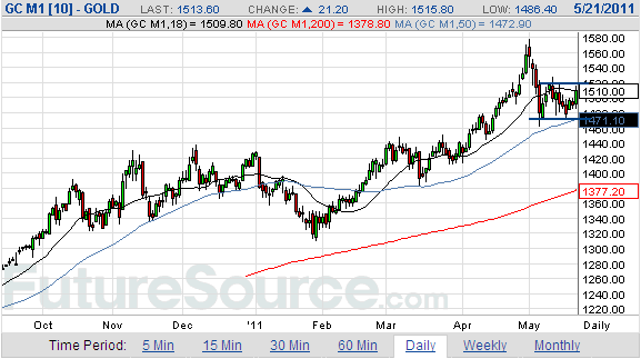
Zooming in on gold's
short-term price action, the following daily chart shows that June gold
has support at $1470 and resistance at $1520. The aforementioned
support can now be used as the demarcation line between the gold market
still having a realistic chance of making a new high in the near future
and that chance being eliminated. Specifically, a daily close below
$1470 could now be considered clear-cut evidence that an
intermediate-term peak was put in place at the beginning of May.
Early this year, when
many analysts were forecasting substantial weakness in the gold price
despite the total lack of evidence that anything more than a routine
short-term pullback was underway, we said that anyone waiting for an
opportunity to buy gold below $1200/oz would probably be waiting
forever. We now think that anyone waiting to buy gold below $1250/oz
will be waiting forever, and that the mid-$1300s represents the next --
or current, if an intermediate-term peak is already in place --
correction's likely downside potential.
In our opinion, the Bernanke-led Fed will not allow a future deflation
scare to gather enough momentum to create major downside in the gold
price. We suspect that it would take no more than a 15% decline in the
stock market to prompt the introduction of "QE3".
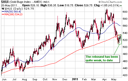
Gold Stocks
The HUI rebounded over the past week, but the rebound hasn't exactly
been impressive. It is fair to say that the HUI has traded heavily,
despite being sufficiently 'oversold' to prompt a meaningful bounce.
Our view is that the current rebound will, at BEST, extend to
resistance at 560-570, and that the rebound will be followed by a
decline to new lows for the year. 475 still looks like a realistic
target for a correction low.
Based on the seasonal/cyclical tendencies demonstrated by the gold
sector over the past decade, a correction low is likely during June but
the next intermediate-term rally probably won't begin until
October-November. The most likely scenario, then, would entail a 1-2
month rebound from a June low followed by an October test of the June
low.
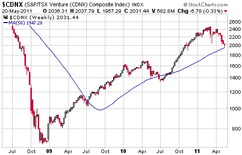
The following weekly
chart shows that the TSX Venture Composite Index (CDNX), a reasonable
proxy for junior resource stocks, began to trend downward in March and
touched its 50-week moving average last week. The current correction
looks similar to the intermediate-term corrections that occurred during
2004 and 2006. If the similarities continue, the CDNX will trade about
10% below its 50-week moving average at some point over the next two
months and will return to its March-2011 peak by the first quarter of
next year.
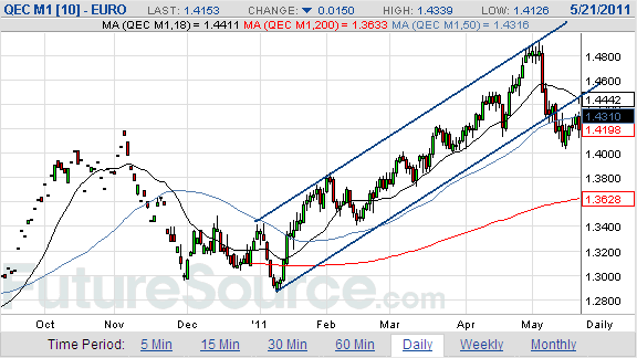
Currency Market Update
After ignoring it for much of the past 10 months, the currency market's
attention has recently turned to the euro zone's huge sovereign debt
problem. The inevitability of a debt default by the government of
Greece, the increasing probability of debt defaults by the governments
of Ireland and Portugal, and the potential for similar issues to engulf
Spain and Italy have begun to create some uncertainty regarding the
future of Europe's monetary union. Hence, the euro's break below the
bottom of its short-term channel.
It should be
understood that there isn't an inherent problem with many different
countries sharing the same currency (monetary union). After all, during
the second half of the 19th Century almost every country in the world
managed to successfully use the same currency (gold). The euro zone's
most basic problem isn't that a bunch of disparate countries use the
same currency, it's that a central planning agency sets the price of
short-term credit across all of these countries. This situation
naturally led to inflation-fueled booms in some countries, which, in
turn, just as naturally led to economic busts. And now that the busts
are in progress, the central planners are trying to manipulate the
situation in such a way as to prevent banks and other bondholders from
taking large losses on their investments in the debt of some
governments. The whole thing is just another in a long line of central
planning disasters, but keep in mind that this disaster is still in its
infancy.
It should also be understood that the interest rate advantage that the
euro currently enjoys over the US$ won't prevent the euro from trending
lower against the US$ over the next 6 months. The reason is that the
EUR/USD exchange rate already factors in the current interest rate
differential as well as the changes that are expected to occur over the
next 12 months. If expectations change such that the ECB's target rate
isn't expected to increase as much relative to the Fed's target rate,
then the interest rate backdrop would become US$-bullish. For example,
if the market currently expects the euro's short-term interest rate
advantage to expand from 1% to 2% over the next 12 months, but economic
weakness in Spain and Italy subsequently makes the market believe that
the rate advantage will remain at 1%, then the euro will be pressured
downward against the US$ due to this change in expectations.
Update
on Stock Selections
(Notes: 1) To review the complete list of current TSI stock selections, logon at http://www.speculative-investor.com/new/market_logon.asp
and then click on "Stock Selections" in the menu. When at the Stock
Selections page, click on a stock's symbol to bring-up an archive of
our comments on the stock in question. 2) The Small Stock Watch List is
located at http://www.speculative-investor.com/new/smallstockwatch.html)
 Batero Gold (TSXV: BAT). Recent price: C$3.09 Batero Gold (TSXV: BAT). Recent price: C$3.09
The article posted HERE provides an overview of the BAT story. BAT is not an 'official' TSI stock selection, but it is a member of the TSI Small Stocks Watch List.
As mentioned in the article, unlike many large, low-grade
porphyry-style gold-copper deposits, the highest-grade portion of the
La Quinchia deposit being drilled by Batero begins at the surface and
extends down to about 200m below the surface (the overall deposit
extends to at least 600m below the surface). With many similar
deposits, the highest-grade section of the resource begins a few
hundred metres below the surface. This is important because it greatly
increases the probability that BAT's deposit will prove to be economic.
In the 4th May Interim Update we mentioned that BAT would be a good
candidate for new buying near support at C$3.00. As illustrated below,
this support was tested late last week.
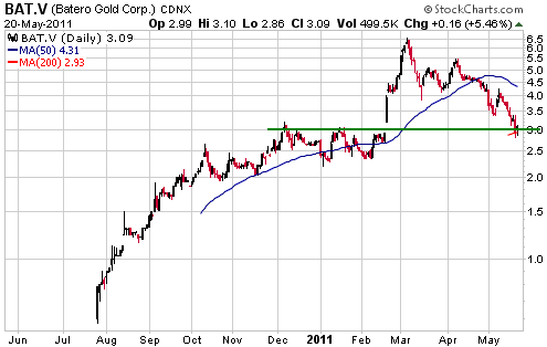
Note that when we
mention prices at which a stock would become a good candidate for
buying or selling, it is not a forecast that the stock will move to
that price. However, we wouldn't mention these potential
below-the-market buy levels or above-the-market sell levels unless we
thought that the stock in question had a realistic chance of getting to
that level.
If the overall market is weak then stocks will tend to overshoot our
suggested buy levels and fall short of our suggested profit-taking
levels, whereas if the overall market is strong they will tend to
reverse upward before hitting our suggested buy levels and blow through
our suggested profit-taking levels. That's why it is important to
gradually scale in and out over time.
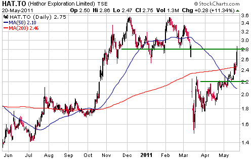
Hathor Exploration (TSX: HAT). Shares: 107M issued, 117M fully diluted. Recent price: C$2.75
Exploration-stage uranium miner HAT has now completely retraced its
Fukushima-related price decline. There's a good chance that it will
move considerably higher over the next 12 months, almost regardless of
what happens to the price of uranium. This is due to the size, grade
and location of its Roughrider project. However, if, like us, you were
an aggressive buyer of HAT shares following the March crash then you
now have a good opportunity to harvest some gains.
Depending on your current situation, near Friday's closing prices it
could make sense to sell some HAT.TO -- while retaining a sizable core
position -- and purchase some UEX.TO.
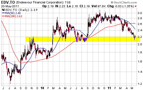
Endeavour Mining (TSX: EDV). Recent price: C$2.19
There is exposure to EDV in the TSI List via the February-2014 C$2.50 warrants (TSX: EDV.WT.A).
EDV is sitting on a large pile of cash, which limits the stock's
downside risk but also limits its upside potential by reducing its
leverage to gold. The company currently owns the 80K-oz/yr Youga gold
mine in Burkina Faso and plans to use its cash hoard to purchase
another in-production gold mine, but it is taking an inordinately long
time to do a deal.
The stock has fallen back to an area of long-term support (see chart
below), where it is a reasonable candidate for new buying. However, it
will be difficult for us (or anyone) to become enthusiastic about EDV
until after the company has announced its next gold-mining acquisition.
Chart Sources
Charts appearing in today's commentary
are courtesy of:
http://stockcharts.com/index.html
http://www.futuresource.com/

|