|
-- Weekly Market Update for the Week Commencing 25th June 2007
Big Picture
View
Here is a summary of our big picture
view of the markets. Note that our short-term views may differ from our
big picture view.
Bonds commenced a secular BEAR market in
June of 2003. (Last
update: 22 August 2005)
The stock market, as represented by the S&P500 Index, commenced a secular BEAR market during the first quarter of 2000. The rally
that
began in October of 2002 will end during the first half of 2007. The ultimate bottom of
the secular bear market won't occur until the next decade. (Last update: 02 October 2006)
The Dollar commenced a secular BEAR market during the final quarter of 2000. The
first major downward leg in this bear market ended during the first
quarter of 2005, but a long-term bottom won't occur until 2008-2010. (Last update: 28 March 2005)
Gold commenced a
secular bull market relative to all fiat currencies, the CRB Index,
bonds and most stock market indices during 1999-2001. The first major
upward leg in this secular bull market ended in December of 2003, but a
long-term peak won't occur until at least 2008-2010. (Last update: 13
February 2006)
Commodities, as
represented
by the CRB Index, commenced a secular BULL market in 2001. The first
major upward leg in this bull market ended during the second quarter of
2006, but a long-term
peak won't occur until at least 2008-2010. (Last update: 08 January 2007)
Copyright
Reminder
The commentaries that appear at TSI
may not be distributed, in full or in part, without our written permission.
In particular, please note that the posting of extracts from TSI commentaries
at other web sites or providing links to TSI commentaries at other web
sites (for example, at discussion boards) without our written permission
is prohibited.
We reserve the right to immediately
terminate the subscription of any TSI subscriber who distributes the TSI
commentaries without our written permission.
Outlook Summary
Market
|
Short-Term
(0-3 month)
|
Intermediate-Term
(3-12 month)
|
Long-Term
(1-5 Year)
|
Gold
|
Neutral
(16-May-07)
|
Bearish
(21-May-07)
|
Bullish
|
US$ (Dollar Index)
|
Bullish
(11-Jun-07)
| Bullish
(31-May-04)
|
Bearish
|
Bonds (US T-Bond)
|
Neutral
(26-Mar-07)
|
Bearish
(26-Mar-07)
|
Bearish
|
Stock Market (S&P500)
|
Neutral
(13-Jun-07)
|
Neutral
(26-Mar-07)
|
Bearish
|
Gold Stocks (HUI)
|
Neutral
(16-May-07)
|
Bearish
(21-May-07)
|
Bullish
|
| Oil | Neutral
(12-Mar-07)
| Neutral
(25-Sep-06)
| Bullish
|
Industrial Metals (GYX)
| Bearish
(11-Jun-07)
| Neutral
(26-Mar-07)
| Bullish
|
Notes:
1. In those cases where we have been able to identify the commentary in
which the most recent outlook change occurred we've put the date of the
commentary below the current outlook.
2. "Neutral", in the above table, means that we either don't have a
firm opinion on which way the market will move or that we expect the
market to be trendless during the timeframe in question.
3. Long-term views are determined almost completely by fundamentals,
intermediate-term views by giving an approximately equal weighting to
fundmental and technical factors, and short-term views almost
completely by technicals.
Natural Gas Cycles
...short-term
supply/demand fundamentals remain moderately bearish...At the same
time, the long-term fundamentals are becoming increasingly bullish.
Around this time last year we used a monthly price chart to illustrate
that natural gas (NG) has a strong tendency to peak during
December-February (usually December) and bottom during August-September
(usually September). At that time we concluded: "...with
December-2005 having provided us with an intermediate-term peak the
odds are clearly in favour of natural gas making an intermediate-term
bottom in either August or September of this year [2006], with
September being the more likely candidate."
NG did end up making an intermediate-term bottom in September of
2006. As a result there have now been six December-February
intermediate-term peaks over the past 12 years (not counting the
December-2006 peak) and with one exception (1997) each of these peaks
has been followed by an intermediate-term bottom during the ensuing
August-September period.
An updated version of the aforementioned chart is included herewith.
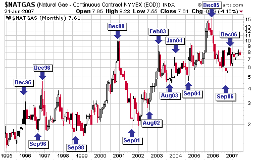
If NG continues to
follow this cyclical pattern then the next intermediate-term rally will
begin from whatever low is made during the August-September period this
year. Furthermore and as discussed in last week's Interim Update,
recent price action suggests that a decline towards an August-September
low is already underway.
Interestingly, the seasonal chart included below reveals a slightly
different pattern from the one we've divined by looking at monthly
charts of NG futures in that it points to a seasonal low in July and a
higher low in September.
Combining our interpretation of NG price cycles with the seasonality
indicated by the following chart, we think the most likely sequence of
events over the coming 2-3 quarters is:
1. A price low in July
2. A second low in September, with weather-related factors determining
if September's low is above or below July's low (in the absence of an
unusually-warm North American summer or hurricanes that cause
significant damage to off-shore production facilities in the Gulf of
Mexico, we suspect that the September low will be below the July low).
3. A strong 2-4 month rally
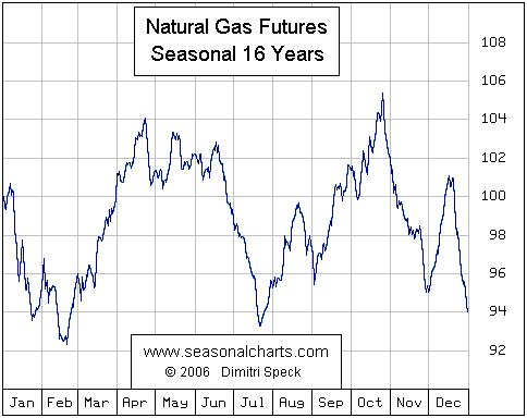
The reason we favour
a September low over a July low is that short-term supply/demand
fundamentals remain moderately bearish (the amount of NG in storage in
the US is well above the 5-year average for this time of the year), and
these short-term fundamentals are unlikely to change much over the next
three months unless uncommonly warm temperatures cause a
larger-than-normal surge in demand or hurricanes disrupt supply.
At the same time, the long-term fundamentals are becoming increasingly
bullish. For example, the amount of NG-related drilling in Canada has
plunged over the past year, and Encana, the country's largest NG
producer, recently announced that it was not planning to ramp-up its
drilling activity anytime soon. Canada's NG production is therefore
likely to fall over the coming 1-2 years. And while US-based NG
exploration/production companies have substantially increased their
drilling activity over the past year, this doesn't imply increased
production because in the US it's a matter of running fast in order to
stand still. The reason is that substantial increases in the amount of
drilling are needed in the US just to stop NG production from falling.
The supply of NG will therefore probably fall, or at best remain
constant, over the coming two years. However, the demand for NG is
likely to rise due to the steady increase in the overall demand for
energy and the large energy-equivalent discount to oil at which NG
currently trades (at Friday's closing prices NG was more than 30%
cheaper than oil on a BTU-equivalent basis). Additionally, due to the
dramatic increase in the price of uranium* and the fact that it costs a
lot more, per megawatt of generating capacity, to build a
uranium-fueled power plant than to build a gas-fueled power plant, some
of the proposed nuclear power plants cited as part of the long-term
bullish case for uranium might end up being gas-fueled plants; unless,
of course, there's a sufficiently dramatic rise in the price of NG over
the next 1-2 years to circumvent such an outcome.
Further to the above, we continue to like the energy trusts that have
high NG weightings and would view a pullback in the NG price to a
cyclical/seasonal low over the coming 1-3 months as an opportunity to
accumulate these stocks.
*At the current
spot uranium price the cost of fuel at a typical nuclear power plant
would be more than half the total cost of production, and nuclear power
would no longer enjoy a significant production-cost advantage over
fossil-fuel-generated power. This is not apparent in the production
costs currently being reported by utilities because most nuclear power
plants are paying a small fraction of today's spot uranium price due to
the long-term supply contracts that were put in place years ago. It
will be a very different story, though, for the nuclear power plants of
the future.
The Stock
Market
China
A crash pattern entails the following sequence:
1. A large rally to a price peak, usually with upward acceleration during the months leading up to the eventual peak
2. An initial short and sharp decline
3. A rebound that retraces 50%-100% of the initial decline and convinces 'the masses' that the upward trend has resumed
4. A decline that takes the price back to the low of the initial decline
5. A break below the low of the initial decline, leading to panicked
liquidation (the crash) in response to the sudden widespread
realisation that the trend has changed
On those rare occasions when crashes occur, the time between the major price peak and the crash is usually about two months.
The reason we mention the above is that China's stock market, as
represented on the following chart by the Shanghai Stock Exchange
Composite Index (SSEC), has possibly just completed Step 3 of a crash
pattern.
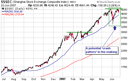
If the SSEC moves to
a new high for the year at any time over the next few weeks then the
possibility that it is tracing out a crash pattern will be eliminated.
However, if it drops back to near its early-June low within the next 4
weeks then the crash scenario will move to centre-stage.
In our opinion, the most bullish outcome for the SSEC would involve a
few months of consolidation between the May high and the June low. Our
reasoning is that China's policy-makers would not look kindly upon a
surge to new highs in the very near future because it would indicate
that their earlier measures aimed at dampening speculation had been
totally ineffective; but a few months of high-level consolidation would
create the appearance of sustainable progress.
Note that the potential for a crash in China's stock market is a very
long way from being the biggest risk facing the US stock market. As far
as the US stock market is concerned, risks of far greater significance
include the potential for additional weakness in bonds, the potential
for the Yen carry trade to unwind, and even the potential for a
financial crisis revolving around mortgage-related debt and/or debt
derivatives.
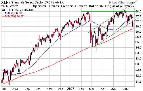
Current Market Situation
The US stock market continues to be weighed down by interest rate
sensitive sectors such as the banks, the non-bank financial companies,
the utilities, the REITs, and the homebuilders. We think this makes
sense, given our bearishness on bonds.
The first of the following charts illustrates the performance of XLF,
an ETF focused on the financial sector. The chart has a bearish tinge
in that it reveals a May test of the February peak followed by a
pronounced downward reversal.
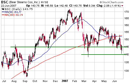
The second chart has more than just a bearish tinge. It illustrates the
performance of Bear Stearns (NYSE: BSC), a very prominent Wall St firm
that has recently been in the news
due to the losses suffered by two of the multi-billion-dollar hedge
funds it manages. BSC ended last week below intermediate-term support
at $145 and just above 'last ditch' support defined by its March low.
The Bear Stearns hedge funds in question specialise in trading
Collateralised Debt Obligations, or CDOs, which are bonds backed by
home mortgages of varying risk (in some cases, backed by mortgages
taken-out by people without the financial capacity to make any
repayments whatsoever). The market for these CDOs is opaque and has the
potential to become very illiquid very quickly in response to
instability. Unfortunately (but not surprisingly to anyone who has been
paying attention), it seems that the big moves in interest rates and
the increases in mortgage default rates that have occurred over the
past several months have created enough instability to disrupt the CDO
market.
We have no idea whether the problems currently being experienced by the
Bear Stearns hedge funds and the CDO market will mushroom into
something that has a major adverse effect on the broad stock market in
the near future. We suspect that it won't because at this stage there
is scant evidence of stress outside the interest rate sensitive sector
of the market. In particular, we are not seeing a market-wide shift
away from risk; at least, we aren't seeing it yet.
This week's
important US economic events
| Date |
Description |
Monday Jun 25
| Existing Home Sales
|
Tuesday Jun 26
| Consumer Confidence
New Home Sales
| | Wednesday Jun 27
| Durable Goods Orders
| | Thursday Jun 28
| FOMC Policy Statement
Q1 GDP (final)
| | Friday Jun 29
| Personal Income and Spending
Chicago PMI
Construction Spending
|
Gold and
the Dollar
Gold and Silver
The inflation-adjusted gold price
...the
really impressive phase of gold's bull market -- the phase where the
sheer magnitude of the price rise forces everyone to sit up and take
notice -- won't begin until the early years of the next decade.
In the 18th June Weekly Market Update we included a chart showing the
Dow/M3 ratio, that is, we included a chart showing the Dow Industrials
Index adjusted for changes in the total supply of US dollars. This was
a useful thing to do because a) it provided additional backup for our
view that US equities are entrenched in a secular bear market, and b)
it showed that long-term trends in the Dow/M3 ratio are similar to
long-term trends in the Dow/gold ratio. This latter point is
significant because it validates our opinion that the REAL
(inflation-adjusted) long-term trend of any market can be seen by
looking at the market's performance relative to gold.
So, we can look at a market's performance relative to gold if we want
to see how it has performed in real terms over a very long time-span
(10 years or more). But how can we see how gold, itself, has performed
in real terms?
One way is by looking at gold's performance relative to other
commodities or other investments; for example, by looking at the
gold/GYX ratio (gold relative to an index of industrial metals) and/or
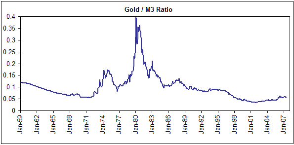
the gold/Dow ratio. Another way is by looking at the gold/M3 ratio (the
gold price adjusted for changes in the total supply of US dollars),
because by doing so we see how gold has performed in inflation-adjusted
terms using ACTUAL inflation (money supply growth) rather than the
fictitious price indices that purportedly represent the effects of
inflation. We have therefore included a chart of the gold/M3 ratio
below.
Here are some brief observations/thoughts relating to the chart:
The gold price was fixed at $35/ounce from 1933 through to 1971 while
the supply of money was in a steady upward trend. As a result, during
this period the inflation-adjusted gold price was in a steady decline
(when the gold price was fixed, every increase in the money supply
caused gold's real price to fall). This meant that by the time the
official link between gold and the US$ was severed (1971) the real gold
price had a lot of catching-up to do; hence the sharp rise in gold/M3
during the first half of the 1970s.
When the 1970s came to an end gold had done a lot more than just
catch-up to where it should have been based on money supply changes
alone. To be specific, spiraling inflation fears, as opposed to actual
inflation, caused gold's real price to overshoot its mark by a wide
margin. This overshoot set the stage for the pendulum to swing back in
the other direction; and swing back it did to the extent that by the
time the new millennium rolled around the inflation-adjusted gold price
was even lower than it had been at the beginning of the 1970s.
Since 2001 the real gold price has risen steadily, but the bull market
has not been particularly impressive to date. Our thinking is that the
really impressive phase of gold's bull market -- the phase where the
sheer magnitude of the price rise forces everyone to sit up and take
notice -- won't begin until the early years of the next decade. We do,
though, expect to see significant additional gains over the remainder
of this decade.
Current Market Situation
As noted in recent commentaries, our view is that gold is rebounding in
response to becoming very oversold. If this rebound is of the routine
counter-trend variety (our view) then the gold price will move up to
the 670s before rolling over and resuming its intermediate-term
decline.
A daily close below $650 (basis the August contract) would confirm our
bearish intermediate-term outlook whereas a daily close above $700
would negate it.
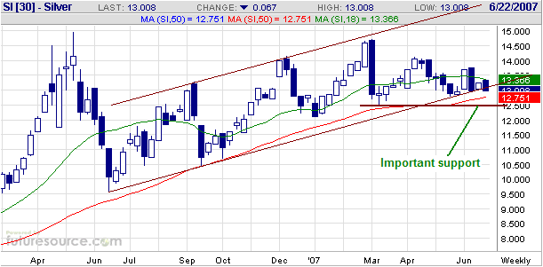
The following weekly chart shows that silver is testing the bottom of
the price channel that began to form around this time last year.
However, from our perspective the most important nearby support lies at
$12.50.
A weekly close below $12.50 by the nearest silver futures contract
(currently the July contract) would suggest to us that silver was
headed for a test of its June-2006 low.
Gold Stocks
The following weekly chart shows the channel in which the AMEX Gold
BUGS Index (HUI) has traveled since the beginning of its long-term bull
market. The HUI needs to rally over the next few weeks to avoid
breaking below the bottom of this channel.
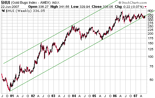
We don't consider the
channel bottom to be important support, for a number of reasons. For
one thing, channels and trend-lines are always somewhat arbitrary (like
beauty, they are in the eye of the beholder in that different people
will draw the lines in different places). For another thing, markets
aren't so simple that all you need to do to ascertain the trend is draw
a line that intersects a few peaks or troughs on a price chart. Having
said that, if the HUI were to break decisively below the bottom of its
long-term channel in the near future we would consider it to be
evidence that a larger-degree correction commenced in May of 2006.
We are expecting a break below the channel bottom at some point over
the next couple of months -- probably after another 2-3 weeks of upward
drift to work-off the gold sector's 'oversold' condition -- because a
larger-degree correction probably did commence in May of 2006. But note
that the channel break, assuming it actually occurs, won't signal an
end to the long-term bull market; rather, it will just be belated
confirmation that the FIRST major upward leg in gold's long-term bull
market ended last year.
In all likelihood, by the time the long-term bull market ends it will
have had either two or three major upward legs (the gold stock bull
market of the 60s and 70s contained three).
The most significant short-term support levels for the HUI are defined
by the May low (317) and the March low (311). There is resistance in
the 340s, but the most important short- and intermediate-term
resistance lies at 370 (a daily close above 370 would invalidate our
intermediate-term bearish outlook).
Currency Market Update
...it
will make sense to assume that the short-term trend for commodities,
and, as a consequence, the C$, is marginally positive until/unless the
CCI breaks-out to the downside.
Today we are going to take a quick look at the Canadian Dollar.
Relative interest rate and money-supply growth rate considerations
point towards a sizeable decline in the C$ against the US$ over the
coming year, but in the short-term the only thing that seems to matter
is the PERCEIVED trend for commodities. Specifically, the C$ tends to
be relatively strong when commodities are generally perceived to be in
an upward trend and relatively weak when commodities are generally
perceived to be in a downward trend, almost regardless of anything else.
With the aim of providing further explanation regarding the
aforementioned link between the C$ and the perceived commodity price
trend we'll review the following chart comparison between the C$ and
the CCI (Continuous Commodity Index).
The chart shows that the C$ and the CCI were in synch with each other
until October of last year, at which point they began to move in
opposite directions. This divergence -- characterised by an upward
trend in the CCI in parallel with a downward trend in the C$ --
continued until early February of this year, and, we think, was due to
the general perception that commodity prices were about to roll-over.
However, around February-March of this year it began to dawn on market
participants that the commodity trend was still positive; and when this
realisation began to take hold there was an abrupt reversal in
sentiment toward the C$, igniting a large catch-up move in this
currency.
In other words, the October-2006 through to February-2007 divergence
between the C$ and the CCI had to be eliminated via either a plunge in
the CCI or a moon-shot by the C$. As things turned out, it was the
latter.
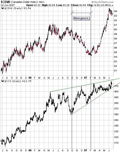
The CCI has been
grinding upward over the past year in a "rising wedge" pattern, which
is a pattern commonly interpreted as being bearish. Our experience with
this type of price pattern, however, is that it ends in an upside
breakout just as often as it ends in a downside breakout. We therefore
consider it to be a neutral pattern.
Our guess is that when a breakout occurs it will be to the downside,
but there's no reason to guess. Instead, it will make sense to assume
that the short-term trend for commodities, and, as a consequence, the
C$, is marginally positive until/unless the CCI breaks-out to the
downside. Such a breakout in the near future would require a daily
close below 400.
Update
on Stock Selections
(Note: To review the complete list of current TSI stock selections, logon at http://www.speculative-investor.com/new/market_logon.asp
and then click on "Stock Selections" in the menu. When at the Stock
Selections page, click on a stock's symbol to bring-up an archive of our comments on the stock in question)
 International Royalty Corp. (TSX: IRC, AMEX: ROY). Shares: 68M issued, 77M fully diluted. Recent price: C$6.79 International Royalty Corp. (TSX: IRC, AMEX: ROY). Shares: 68M issued, 77M fully diluted. Recent price: C$6.79
IRC provides exposure to several metals, but the main ones are nickel
(via a royalty on CVRD's Voisey's Bay project) and gold (via a royalty
on Barrick Gold's Pascua-Lama development-stage gold project and
royalties on a few smaller-scale operating gold mines). With the nickel
price having dropped by 25% -- from a May high of US$24/pound to
Friday's closing price of US$18/pound -- and the gold price having
drifted lower over the past month, IRC's stock price has understandably
been weak of late (see chart below).
Using conservative long-term metal price assumptions of US$14/pound for
nickel, US$2.50/pound for copper and US$600/ounce for gold, we come up
with a rough valuation of around US$7.30 (C$7.80) per share for IRC.
This valuation assumes a 10-times cash flow multiple (low for a royalty
company) and assigns no value to any of IRC's dozens of royalty
projects with the exceptions of Pascua-Lama and the ones that are
already generating revenue. On this basis, IRC was slightly over-valued
at last month's high and is now slightly under-valued.
Technically, the stock has support in the low C$6 area defined by its
2006 peak and its 200-day moving average. A drop to this area would
create a good buying opportunity.
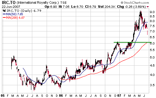
In our opinion IRC
deserves to be part of an equity investor's 'core' exposure to metals.
In fact, it would be one of the first stocks we would buy if we were
currently building-up a core position in metals. It doesn't offer as
much leverage as a normal mining stock, but it offers the big advantage
of not being exposed to increases in mining costs since its royalties
are based on revenue rather than profit (IRC takes a cut of the gross
revenue generated by the mines on which it has royalties).
Chart Sources
Charts appearing in today's commentary
are courtesy of:
http://stockcharts.com/index.html
http://www.futuresource.com/

|
