|
-- Weekly Market Update for the Week Commencing 26th June 2006
Big Picture
View
Here is a summary of our big picture
view of the markets. Note that our short-term views may differ from our
big picture view.
Bonds commenced a secular BEAR market in
June of 2003. (Last
update: 22 August 2005)
The stock market, as represented by the S&P500 Index, commenced a secular BEAR market during the first quarter of 2000. The rally
that
began in October of 2002 will end by the first quarter of 2006 and will
be followed by a substantial decline to a higher low (above the
Oct-2002 bottom) during the second half of 2006. The ultimate bottom of
the secular bear market won't occur until the next decade. (Last update: 12 December 2005)
The Dollar commenced a secular BEAR market during the final quarter of 2000. The
first major downward leg in this bear market ended during the first
quarter of 2005, but a long-term bottom won't occur until 2008-2010. (Last update: 28 March 2005)
Gold commenced a
secular bull market relative to all fiat currencies, the CRB Index,
bonds and most stock market indices during 1999-2001. The first major
upward leg in this secular bull market ended in December of 2003, but a
long-term peak won't occur until at least 2008-2010. (Last update: 13
February 2006)
Commodities, as
represented
by the CRB Index, commenced a secular BULL market in 2001. The first
major upward leg in this bull market will end during the first quarter of
2006, but a long-term
peak won't occur until at least 2008-2010. (Last update: 13 February 2006)
Copyright
Reminder
The commentaries that appear at TSI
may not be distributed, in full or in part, without our written permission.
In particular, please note that the posting of extracts from TSI commentaries
at other web sites or providing links to TSI commentaries at other web
sites (for example, at discussion boards) without our written permission
is prohibited.
We reserve the right to immediately
terminate the subscription of any TSI subscriber who distributes the TSI
commentaries without our written permission.
Outlook Summary
Market
|
Short-Term
(0-3 month)
|
Intermediate-Term
(3-12 month)
|
Long-Term
(1-5 Year)
|
Gold
|
Bullish
(14-Jun-06)
|
Neutral
(08-Mar-06)
|
Bullish
|
US$ (Dollar Index)
|
Bullish
(21-Apr-06)
| Bullish
(31-May-04)
|
Bearish
|
Bonds (US T-Bond)
|
Bearish
(19-Jun-06)
|
Bearish
(02-Jan-06)
|
Bearish
|
Stock Market (S&P500)
|
Neutral
(22-May-06)
|
Bearish
(05-Jan-05)
|
Bearish
|
Gold Stocks (HUI)
|
Bullish
(12-Jun-06)
|
Neutral
(08-Mar-06)
|
Bullish
|
General Commodities (CRB)
|
Bearish
(15-May-06)
|
Bearish
(23-Mar-05)
|
Bullish
|
Notes:
1. In those cases where we have been able to identify the commentary in
which the most recent outlook change occurred we've put the date of the
commentary below the current outlook.
2. "Neutral", in the above table, means that we either don't have a
firm opinion on which way the market will move or that we expect the
market to be trendless during the timeframe in question.
3. Long-term views are determined almost completely by fundamentals,
intermediate-term views by giving an approximately equal weighting to
fundmental and technical factors, and short-term views almost
completely by technicals.
Shanghai / TSI Schedule
Over the next 2 weeks my
family (wife and 6-year-old son) and I will be moving from our current
location near Guangzhou to Shanghai. The reason for the move is that
Shanghai is far more cosmopolitan than Guangzhou and has a lot more to
offer us in terms of schools, leisure activities, shops and
restaurants.
As a quick introduction for those unfamiliar with this part of the
world, Shanghai is a huge city with a population reported to be
somewhere between 15M and 30M (I've read many different estimates of
the population, so I guess a lot depends on how the city limits are
defined). It is located close to the coast at similar latitude to San
Diego and is about as far north of the equator as Perth, Western
Australia is south of the equator. It has the world's largest cargo
port and is the financial capital of China (it is the New York of
China).
Shanghai is, in effect, two cities separated by the HuangPu River and
connected via a number of tunnels and bridges, with the west side of
the river known as PuXi ("xi" means west) and the east side of the
river known as PuDong ("dong" means east).
The west side (PuXi) is the original city. It contains an interesting
mixture of grand old European-style buildings (buildings that were
built by the Europeans during colonial times), traditional Chinese
districts and old-style housing as well as modern office buildings,
shopping centres, hotels and apartment buildings. It is the more
interesting side of Shanghai for tourists, but is quite congested
(traffic jams are common).
The east side (PuDong) is the new city. When I first visited Shanghai
about 9 years ago PuDong was almost entirely farmland. Now, however,
it's a huge modern city with numerous skyscrapers (including Jin Mao,
the world's 4th tallest building), hotels, shopping centres, industrial
developments, international schools, modern hospitals, housing estates
(mostly high-rise, but some low-rise), excellent sporting and cultural
facilities, and, fortunately, lots of parks and greenery. Because the
city has been developed from scratch during modern times it has an
efficient road system designed to cater for large numbers of cars,
which means that traveling around PuDong by car tends to be relatively
quick and easy.
We are moving to PuDong.
I'm looking forward to living in Shanghai, but am dreading the move
itself. The fact that I operate out of a home office means that moving
house involves setting up a new office in the new location in addition
to setting up a new house, but there's a lot that can't be set up until
we actually arrive in Shanghai. The way it's going to work is that
there will be a few days late this week when we'll be living in a hotel
in Guangzhou while everything gets packed up and shifted out of the old
house. We'll then fly to Shanghai, but our stuff won't arrive until at
least three days after we get there. As a result, we'll be living in a
hotel in Shanghai for a few days next week while we wait for our things
to arrive from Guangzhou and arrange phone/internet connections, etc.,
at the new house.
At this stage, I think the effect of all this on the publishing schedule for TSI commentaries will be as follows:
- There will be an Interim Update at the normal time on Thursday 29th June
- There won't be a Weekly Update on Sunday 2nd July
- There should be an Interim Update on Thursday 6th July,
although it will probably be abbreviated and might be text only (no
charts)
Thereafter, everything SHOULD be back to normal.
The next meeting of the price fixers
The
US central planning agency responsible for creating inflation, managing
inflation expectations and influencing what people do with their money
(by fixing the price of short-term credit) meets this week and is
scheduled to announce its new policy directive on Thursday. In other
words, the Fed is meeting this week to set the official short-term
interest rate.
According to some reports, the US$ was strong during the final two days
of last week due to the market discounting the prospect of the Fed
opting for a 0.50% rate hike at this week's meeting (as opposed to the
0.25% hikes that have been the norm over the past 2 years). The fact
is, though, that the market is most definitely NOT anticipating a 0.50%
rate hike. We know this because Friday's closing prices for Fed Funds
Futures contracts show that the market is assigning only a 12%
probability to this week's rate hike being more than 0.25%. The market
will therefore be taken by surprise if the Fed does anything other than
raise the Fed Funds rate by 0.25%, as will we.
This doesn't mean that the US$ won't pullback following news of a 0.25%
hike. As discussed later in today's commentary, the Dollar Index is
probably approaching the end of the INITIAL phase of the advance from
its May low.
The Stock
Market
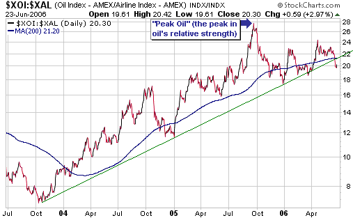
The Oils versus the Anti-Oils
...everyone
is aware of the oil sector's incredibly bullish fundamentals and the
airline sector's incredibly bearish fundamentals and yet the Airline
Index -- the Anti-Oil Index -- has out-performed the Oil Index to the
tune of about 28% over the past 9 months.
We find ratio charts -- charts that illustrate the relative strengths
of different markets -- quite useful because these charts remove the
dollar from the equation. Removing the dollar from the equation is a
useful thing to do because the dollar is constantly changing, as are
all other fiat currencies. This is particularly the case when there's a
lot of inflation (growth in the supply of currency) because in such
situations it's quite likely that some prices will be rising purely as
a result of the decline in the currency's value. By monitoring the
performance of one market or asset class relative to another we can
therefore get a better idea of what investments are REALLY in bull
markets.
One of the most interesting ratios, from our perspective, is the
XOI/XAL ratio (the AMEX Oil Index divided by the AMEX Airline Index).
We like this ratio because it compares the performance of stocks that
benefit from a rising oil price to the performance of stocks that are
hurt by a rising oil price (we sometimes refer to the XAL as the
"anti-oil index" due to the strong tendency of airline stocks to trend
in the opposite direction to the oil price). When a genuine advance
(one not propelled solely by inflation) is underway in the oil sector
then the XOI should not only trend higher in nominal dollar terms; it
should also trend higher relative to the XAL.
The XOI/XAL ratio's current situation is ambiguous. Referring to the
below chart, notice that a peak last September in the wake of Hurricane
Katrina was followed by a sharp 3-month decline and then a modest
rebound to a lower peak. The upward-sloping trend-line dating back to
the 2003 bottom has been breached, but a major trend reversal won't be
confirmed until last December's low is taken out. It's interesting,
though, that everyone is aware of the oil sector's incredibly bullish
fundamentals and the airline sector's incredibly bearish fundamentals
and yet the Airline Index -- the Anti-Oil Index -- has out-performed
the Oil Index to the tune of about 28% over the past 9 months.
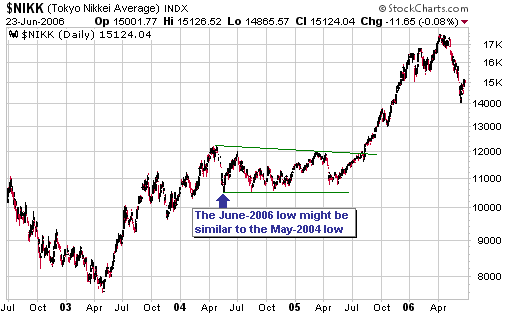
The Japanese Stock Market
Below is a daily chart of Japan's Nikkei225 Index covering the past 4 years.
It's quite possible that an intermediate-term bottom is already in
place for the Nikkei, but if not then the eventual bottom will most
likely be within 10% of this month's low; that is, the bottom will most
likely be somewhere in the 12500-14000 range.
What is probably needed to complete the Nikkei's correction is a lot
more time rather than a lot more price weakness -- something along the
lines of what happened following the May-2004 bottom. Referring to the
below chart, notice that even though the correction that began in
April-2004 lasted about 14 months the price low was put in place during
the first 6 weeks. Something similar this time around would see the
Nikkei retreat to around 14000 a few more times over the coming 12
months before commencing its next major advance.
As noted in last week's Interim Update, we will add the Japan Smaller
Capitalisation Fund (NYSE: JOF) to the TSI Stocks List of it drops to
US$13.00.
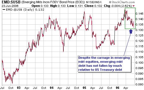
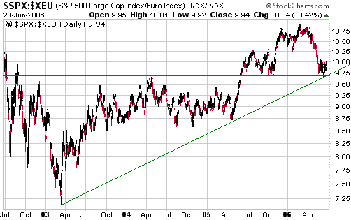
Non-confirmations of the bear case
...as
things currently stand the price action does not clearly support the
view that the cyclical bull market that began in 2003 has ended.
The two charts shown below aren't bullish, but they do show that there
has, to date, been a lack of bearish confirmation. Putting it another
way, we might THINK that a cyclical bear market has begun, but at this
stage some important measures of market performance are yet to
substantiate this opinion.
The first chart shows the EMD/USB ratio (the Emerging Markets Income
Fund divided by the US Treasury Bond). It's message is that there has
been a decline in the value of emerging market debt relative to the
value of lower-risk US Treasury debt over the past 3 months, but the
decline has not been severe. There has clearly been a shift away from
risk in the debt market, but up until now the shift has not been as
great as it should have been if a bear market were underway.
The second chart shows the SPX/euro ratio (the S&P500 Index in euro
terms). How the US stock market performs in euro terms, rather than how
it performs in US$ terms, is what really matters to investors in
Europe. And in terms of the euro the S&P500 broke upward from a
large base during the second quarter of 2005 and recently returned to
the top of this former base. Also, at this month's low the SPX/euro
ratio touched the upward-sloping trend-line dating back to the
March-2003 bottom.
Therefore, there is presently nothing in the price action to
differentiate the May-June decline in SPX/euro from a fairly normal
pullback within an on-going bull market. Now, this doesn't mean that it
won't develop into something more substantial because the initial
decline in a bear market will generally be indistinguishable from a
routine bull-market pullback. The point is, as things currently stand
the price action does not clearly support the view that the cyclical
bull market that began in 2003 has ended. In the SPX/euro's case, a
move below this month's low would provide the missing evidence.
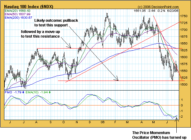
Current Market Situation
Of the three S&P500 scenarios presented in last week's Interim
Update, we favour the one that encompasses a modest 2-3 month rebound
to alleviate the 'oversold' condition followed by a plunge to an
intermediate-term low during the final quarter of the year. This
scenario has the best fit with the following observations/conclusions:
1. Regardless of the fact that leading indicators point towards slowing
economic growth over the remainder of this year, central banks
throughout the world seem determined to tighten monetary policy over
the coming months. Since the deadly combination of slowing growth and
increasingly-strong monetary headwinds are what the future probably
holds in store, it's hard to believe that the ultimate correction lows
are already in place.
2. When the Fed embarks on a rate-hiking campaign it invariably
continues to hike rates until something breaks, but the only things
that have broken over the recent past are things that the Fed doesn't
care about (the Dubai stock market, for instance). The big decline in
US homebuilding stocks over the past 10 months indicates that the US
residential property market might be about to break, but the Fed isn't
yet seeing enough evidence -- enough, that is, to prompt a change of
monetary policy -- of such a break in the backward-looking data upon
which it tends to fixate. Now, the thing that ultimately breaks and
brings about a change of mindset at the Fed won't necessarily be the US
stock market, but until that change of mindset occurs the stock market
will be acutely vulnerable.
3. The oversold extremes reached by many sentiment indicators over the
past few weeks mean that a multi-month rebound is likely prior to a
continuation of the decline.
4. A low during the final quarter of 2006 would mesh with the reliable 4-year stock market cycle.
On the following daily chart of the NASDAQ100 Index we've indicated what we perceive to be the most likely short-term outcome.
This week's
important US economic events
| Date |
Description |
| Monday Jun 26 | New Home Sales
|
| Tuesday Jun 27
| Consumer Confidence
Existing Home Sales
| | Wednesday Jun 28
| No significant events scheduled
| | Thursday Jun 29
| FOMC Policy Statement
Q1 GDP (final)
| | Friday Jun 30
| Personal Income and Spending
Chicago PMI
|
Gold and
the Dollar
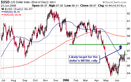
Currency Market Update
We are using the dollar's performance during the first quarter of 2005
as a model for the current situation simply because it implies a price
pattern that makes a lot of sense to us. Important lows and highs are
often tested, particularly in the currency market, so it's reasonable
to expect that the initial rally in what we interpret to be the final
upward leg in the dollar's cyclical bull market will be followed by a
pullback to test the May low before a more substantial advance gets
underway. This is similar to what happened during Q1-2005, at which
time the initial 5-week surge following the end-December low was
followed by a 4-week pullback to a slightly higher low before a large
advance got going.
Prior to last Friday it was possible that the high of the dollar's
initial rally from its May-2005 bottom was already in place, but on
Friday the Dollar Index broke upward from its recent sideways
consolidation (see chart below). This upside breakout points toward
resistance at 88 as a likely target for the initial peak.
Our best guess is that a peak during the coming week or so will be
followed by a pullback to around 85. We wouldn't, however, attempt to
trade this pullback due to the potential for an 'upside surprise'.
Gold and Silver
Current Market Situation
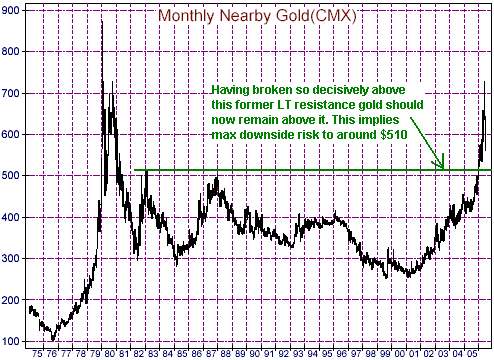
Below is a daily chart of August gold futures. August gold hit an
intra-day low of just below $550 on 14th June and has since been edging
higher. At this stage the rebound that has occurred over the past 7
trading days looks like a counter-trend move, and if this is the
correct interpretation then there should soon be a break to a new
correction low.

Note, though, that if
our long-term bullish outlook on gold is right then no one who is
presently 'long' gold or who is planning to invest in gold should be
spending any time worrying about the possibility of a break to a new
correction low. This is because the short-term downside risk appears to
be trivial compared to the longer-term upside potential. In particular
and as indicated on the following monthly chart of gold futures, the
former long-term resistance at around $510 should now act as a solid
floor. This means that there is probably about $70 of downside risk at
this time. However, fundamentals, price action and sentiment clearly
point toward the gold price exceeding its 1980 peak of $850 within the
next few years. Our guess is that it will trade well into the 1000s,
but there appears to be a minimum of $300 of upside in the gold price
at this time.
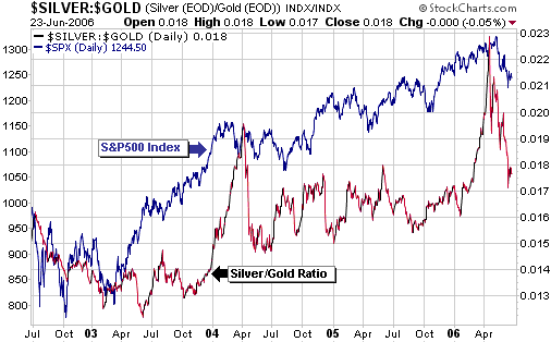
Silver versus Gold
We
therefore expect the silver/gold ratio to rally to well above this
year's high following whatever low it makes over the coming 12 months.
Regardless of all the good arguments that can be put forward in favour
of investing in silver and in support of the view that silver will
out-perform gold by a wide margin over the years ahead, the fact is
that one of the most reliable relationships in the financial world over
the past 35 years -- that is, since the current monetary system came
into being -- can be expressed as follows: Silver out-performs gold
when confidence in the financial system is rising and under-performs
gold when confidence in the financial system is falling. This a
relationship that works extremely well over long periods (periods
measured in years rather than weeks or months), although over the past
several years it has also tended to work well over shorter periods
(periods measured in months). The following chart, for instance, shows
that over the past 4 years there has been quite a strong positive
correlation between the S&P500 Index (a proxy for confidence in the
financial system) and the silver/gold ratio. During this period
important turning points in silver/gold have sometimes followed turning
points in the S&P500 and at other times they've led. In the most
recent case, April's downward reversal in silver/gold led the downward
reversal in the S&P500 by around 3 weeks.
Further to the above,
whether silver does actually out-perform gold over the coming years
will probably be determined, to a large extent, by what happens in
other markets. It makes no sense, for instance, to be forecasting a
major collapse in financial assets and forecasting strength in silver
relative to gold. If there is a major collapse then gold will almost
certainly rocket higher in price relative to silver (and pretty much
everything else in the world) due to its monetary quality.
Our view is that a financial collapse is a low-probability outcome.
Also, although we suspect that the coming 5-9 months will be a tough
period we think that this tough period will be followed by another 1-2
year advance in most financial asset prices. We therefore expect the
silver/gold ratio to rally to well above this year's high following
whatever low it makes over the coming 9 months.
By the way, if our bearish intermediate-term outlook for the stock
market is on-the-mark then it's very unlikely that a sustainable bottom
for the silver/gold ratio was put in place earlier this month. Instead,
there will likely be a rebound in silver relative to gold, and in
silver stocks relative to gold stocks, in parallel with a rebound in
the broad stock market over the next 2-3 months, after which the
intermediate-term decline in silver/gold should resume.
Gold Stocks
The following chart shows what we expect the gold sector --
represented, in this case, by the XAU -- to do over the remainder of
this year. Note that the projection drawn on the below chart is almost
identical to the one drawn on the chart included in the 22nd May Weekly
Update except that today's version reflects the likelihood that the XAU
made its initial bottom (at 120) about 4 weeks earlier than originally
anticipated. Note, as well, that the projection shown below is
consistent with our outlook for the broad stock market (a multi-month
rebound followed by a sharp decline to an intermediate-term low during
the final quarter). The difference is that the gold sector's next
substantial decline should result in a successful test of the June low
whereas we expect the broad stock market to bottom well beneath the
June low.
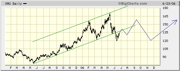
The XAU broke below
the bottom of its upward-sloping channel during the first half of June,
which is exactly what should happen during an intermediate-term
correction. Once a new intermediate-term advance gets underway a new
upward-sloping channel will begin to take form, although it probably
won't be possible to define the upper and lower bounds of this channel
until the advance is almost complete.
Update
on Stock Selections
(Note: To review the complete list of current TSI stock selections, logon at http://www.speculative-investor.com/new/market_logon.asp
and then click on "Stock Selections" in the menu. When at the Stock
Selections page, click on a stock's symbol to bring-up an archive of
our comments on the stock in question)
 DRDGold (NASDAQ: DROOY). Shares: 316M issued, 349M fully diluted. Recent price: US$1.32 DRDGold (NASDAQ: DROOY). Shares: 316M issued, 349M fully diluted. Recent price: US$1.32
A very negative article on DRDGold (NASDAQ: DROOY) has just been published at http://www.mineweb.net/sections/mining_finance/568900.htm.
Everything in the article appears to be correct, but it misses a
critical point. The point is that the merit of any investment is
determined by the inherent worth of the asset RELATIVE TO ITS CURRENT
PRICE. The worst-managed companies can be great investments and the
best-managed companies can be terrible investments; it all depends on
the price you pay.
Taking a quick look at DROOY's inherent worth, the company is producing
gold at the rate of 620K ounces/year. Across the entire industry gold
production is, at this time, being valued by the stock market at an
average of around $3000/ounce, but due to DROOY's inferior management
and lower-quality mining assets let's assume that it deserves to trade
at a 50% discount to the industry-wide average. This means that its
production should be valued at $1500/ounce, giving the company a market
capitalisation of US$930M. This figure is probably reasonable because
Harmony Gold and Golden Star Resources -- companies whose management
has performed almost as poorly as DROOY's -- trade at more than $2000
per ounce of production.
A US$930M market cap for DROOY would mean a stock price of US$2.94, or
123% more than Friday's closing price. Given that gold's bull market
probably has years to go this, in our opinion, makes DROOY a buy.
We like the South African gold producers in general at this time, which
is why we advocated buying Harmony Gold, Harmony Gold call options and
Gold Fields Ltd between late May and mid June. One of the main reasons
we like them is that over the coming 12 months we expect the gold price
in SA Rand terms to build on the large gains achieved during the first
half of this year, causing dramatic turnarounds in the financial
performances of these companies. This is a topic we plan to re-visit
within the coming fortnight.
Chart Sources
Charts appearing in today's commentary
are courtesy of:
http://stockcharts.com/index.html
http://www.futuresource.com/
http://www.decisionpoint.com/
http://bigcharts.marketwatch.com/
http://www.mrci.com/

|
