|
-- Weekly Market Update for the Week Commencing 29th April 2013
Big Picture
View
Here is a summary of our big picture
view of the markets. Note that our short-term views may differ from our
big picture view.
In nominal dollar terms, the BULL market in US Treasury Bonds
that began in the early 1980s will end by 2013. In real (gold)
terms, bonds commenced a secular BEAR market in 2001 that will continue
until 2014-2020. (Last
update: 23 January 2012)
The stock market, as represented by the S&P500 Index,
commenced
a secular BEAR market during the first quarter of 2000, where "secular
bear market" is defined as a long-term downward trend in valuations
(P/E ratios, etc.) and gold-denominated prices. This secular trend will bottom sometime between 2014 and 2020.
(Last update: 22 October 2007)
A secular BEAR market in the Dollar
began during the final quarter of 2000 and ended in July of 2008. This
secular bear market will be followed by a multi-year period of range
trading.
(Last
update: 09 February 2009)
Gold commenced a
secular bull market relative to all fiat currencies, the CRB Index,
bonds and most stock market indices during 1999-2001.
This secular trend will peak sometime between 2014 and 2020.
(Last update: 22 October 2007)
Commodities,
as represented by the Continuous Commodity Index (CCI), commenced a
secular BULL market in 2001 in nominal dollar terms. The first major
upward leg in this bull market ended during the first half of 2008, but
a long-term peak won't occur until 2014-2020. In real (gold) terms,
commodities commenced a secular BEAR market in 2001 that will continue
until 2014-2020.
(Last
update: 09 February 2009)
Copyright
Reminder
The commentaries that appear at TSI
may not be distributed, in full or in part, without our written permission.
In particular, please note that the posting of extracts from TSI commentaries
at other web sites or providing links to TSI commentaries at other web
sites (for example, at discussion boards) without our written permission
is prohibited.
We reserve the right to immediately
terminate the subscription of any TSI subscriber who distributes the TSI
commentaries without our written permission.
Outlook Summary
Market
|
Short-Term
(1-3 month)
|
Intermediate-Term
(6-12 month)
|
Long-Term
(2-5 Year)
|
|
Gold
|
Bullish
(17-Oct-12)
|
Bullish
(26-Mar-12)
|
Bullish
|
|
US$ (Dollar Index)
|
Neutral
(24-Dec-12)
|
Neutral
(09-Jan-12)
|
Neutral
(19-Sep-07)
|
|
Bonds (US T-Bond)
|
Neutral
(12-Nov-12)
|
Neutral
(18-Jan-12)
|
Bearish |
|
Stock Market
(DJW)
|
Bearish
(30-Jul-12)
|
Bearish
(28-Nov-11)
|
Bearish
|
|
Gold Stocks
(HUI)
|
Bullish
(24-Dec-12)
|
Bullish
(23-Jun-10)
|
Bullish
|
|
Oil |
Neutral
(30-Jul-12)
|
Neutral
(31-Jan-11)
|
Bullish
|
|
Industrial Metals
(GYX)
|
Neutral
(30-Jul-12)
|
Neutral
(29-Aug-11)
|
Neutral
(11-Jan-10)
|
Notes:
1. In those cases where we have been able to identify the commentary in
which the most recent outlook change occurred we've put the date of the
commentary below the current outlook.
2. "Neutral", in the above table, means that we either don't have a
firm opinion or that we think risk and reward are roughly in balance with respect to the timeframe in question.
3. Long-term views are determined almost completely by fundamentals,
intermediate-term views by
fundamentals, sentiment and technicals, and short-term views by sentiment and
technicals.
Industrial Metals Update
One of the differences between industrial
metals such as copper and the monetary metal (gold) is that changes in mine
supply are important drivers of industrial metal prices whereas in the gold
market the amount of metal produced by the mining industry during any year is so
small relative to the existing aboveground stock of metal that changes in mine
supply have almost no effect on price. Another way of saying this is that the
industrial metals markets live from hand to mouth whereas the gold market lives
from centuries of accumulated savings.
As far as we can tell, no industrial metal lives from hand to mouth to a greater
extent than platinum. Moreover, the 'hand' side of the market is dominated by
South Africa (about 70% of the world's annual platinum production comes from
South Africa), which creates the potential for the sort of supply disruption
that could have a big positive effect on price. A supply disruption could result
from South African production being curtailed by labour unrest or from mines
being closed due to the rising cost of production (platinum miners are
experiencing the same "cost inflation" as gold miners).
Our view is that due to a worsening global economic downturn the industrial
demand for platinum is more likely to fall than rise over the coming 12 months.
However, platinum's intermediate-term risk/reward is beginning to look
attractive due to the strong potential for a decline in South African mine
supply and the likelihood that the platinum price will be supported during
periods of economic weakness by a rising gold price (we suspect that there is a
downside limit to the platinum/gold ratio).
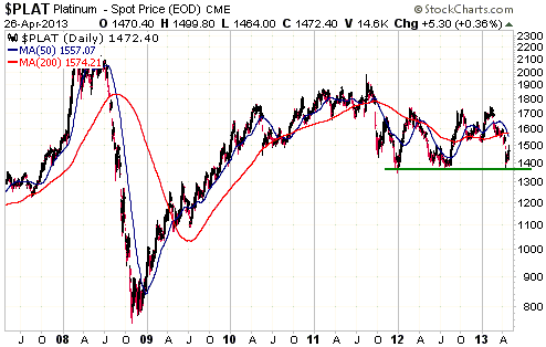
Platinum's price chart (see below) shows that there is critical support in the
high-$1300s. A break below this support could lead to a quick decline to around
$1100, which is the sort of price at which we would be interested in buying this
metal. We would most likely buy via PPLT, the physical platinum ETF.
If platinum continues to hold above support then we will probably stick with the
monetary metal (gold) and the quasi-monetary metal (silver).
The chart of copper shown below looks similar to the chart of platinum shown
above. Copper has critical support at $2.75-$3.00.
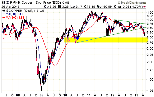
Copper is short-term 'oversold' and could rebound or consolidate over the weeks
ahead. However, there is also a realistic chance that its price will collapse to
$2.50 or even to $2.00. With no price support coming from the supply side of the
supply-demand equation (the global copper inventory is at a 5-year high), more
evidence of economic weakness combined with a sizeable stock market decline
could prompt enough speculative selling of copper to bring about such a
collapse.
Note that we are not forecasting a collapse; we are saying that the potential
exists and is worth taking seriously. As things stand today, the two most likely
time periods for such a price collapse are the next 6 weeks and
September-November of this year.
With copper precariously poised just above critical support it is not surprising
that the stock price of Freeport McMoran (FCX), the world's largest
publicly-traded copper producer, is also precariously poised just above critical
support.
The following chart compares FCX with the Philadelphia Gold and Silver Index (XAU).
FCX is 'oversold', but so was the XAU prior to its recent crash.

Speculators and hedgers should consider taking a bearish position in FCX, either
via put options or short-selling. One possibility is that FCX will plunge within
the next few weeks. Another possibility is that it will consolidate in the
$30-$40 range for the next few months and then suffer a large decline during
September-November.
"Austerity" and the
Reinhart-Rogoff Mistake
In 2010, economists Carmen Reinhart and Kenneth
Rogoff released an influential paper about the effect of government debt on GDP
growth. The paper concluded that a government-debt/GDP ratio of 90% was a sort
of tipping point, with economic growth falling sharply after this point was
reached. As discussed in the article posted
HERE and in many other articles over the past two weeks, it has recently
been discovered that there were errors in the Reinhart-Rogoff (RR) calculations.
Although these errors don't negate the gist of the RR analysis, they have caused
great excitement within the ranks of the anti-austerity campaigners. Here's what
we think.
The root of the issue is that economics is not an empirical science; it's a
logical one. Logic based on irrefutable principles dictates what should be done.
Furthermore, because it is possible to interpret economic data in multiple ways
or validate different conclusions by selectively mining the same data,
interpretation of the historical record should always be done through the lens
of good economic theory. In other words, only after you know the right theory do
you stand a good chance of correctly interpreting the data. Consequently, we
never placed any importance on the RR analysis. We can be sure, based on first
principles and logical deduction, that in general terms the larger the
government the weaker the rate of real economic progress, but there isn't likely
to be any way of conclusively proving this relationship using data. This is
because it isn't possible to run laboratory experiments or wind back time to see
what would have happened to the economy under different levels of government
spending. There is certainly no good reason to expect that a line should be
drawn at a government-debt/GDP ratio of 90%. Good theory simply informs us that
the slower the pace at which the giant parasite called "government" sucks blood
from the economy, the better.
Another issue is that what really matters isn't the amount of government debt
relative to the size of the economy, but rather the amount of government
spending (the size of the government) relative to the size of the economy.
Whether government spending is financed by taxation or debt or inflation is a
secondary and far less significant consideration.
A third issue is that GDP can be a very misleading number, because it only
measures activity. Counter-productive activity that reduces wealth, such as
building something and then blowing it up, gives GDP as much of a temporary
boost as productive activity, which is why some high-profile Keynesians
seriously advocate policies that have the effect of reducing wealth. An
implication is that analyses using GDP are always going to be problematic to
some degree.
Moving along, we mentioned in the opening paragraph that the errors discovered
in the number-crunching of Reinhart-Rogoff have excited the anti-austerity camp,
as though the errors discredited the view that austerity is needed to get the
economy back onto a sustainable growth path. The members of this camp don't
understand that once you've borrowed and spent an excessive amount, austerity is
not a choice; it's a necessity. The only question is how you go about it.
This brings us to the next important issue, which is that the 'austerity or no
austerity' question is typically presented wrongly. The question is almost
always presented along these lines: Do we opt for more government spending and
higher debt, or less government spending combined with higher taxes? Both of
these options are terrible and both constitute the wrong course of action. The
real question is: Do we opt for more government spending and higher debt, thus
digging an even deeper economic hole, or do we create the conditions required
for an escape from the economic hole via LOWER taxes funded by a large reduction
in the size of the government? The correct answer to this question should be
blatantly obvious, but arriving at the correct answer is made difficult by the
strong desire to avoid short-term pain. The fact is that until the economy
reaches a state of total collapse, a course of action that leads to a much
healthier economy over the next five years will often entail greater hardship
over the next 12 months.
An additional point regarding the "austerity" solution is that to maximise its
effectiveness it should not only involve lower taxes and reduced government
spending, it should also involve directly defaulting on government debt (as
opposed to consuming valuable resources in an effort to repay the debt or
indirectly defaulting on the debt via inflation and "financial repression").
Directly defaulting on government debt would ensure that the lenders of money to
the government incurred a disproportionately large amount of the short-term cost
of "austerity", which is the way it should be. Unfortunately, the austerity
programs that have happened and are continuing to happen in Europe have been
mostly about making sure that the lenders of money to the government get their
money back. This is unfair, does not help put the economy on the right path and
gives "austerity" an undeserved bad name.
The bottom line is that the number-crunching errors of Reinhart-Rogoff are
neither here nor there, because the data in isolation can't indicate the right
course of action and because the data are still generally consistent -- which is
the best we can reasonably expect -- with the idea that a larger government
creates a heavier economic burden. Logic indicates that austerity is necessary,
but not the brand of austerity currently being tried.
Money Supply Details
Last week we wrote: "Despite the Fed's
asset monetisation, the rate of US monetary inflation has fallen over the past
few months. This is clearly evident on the following chart of the annualised
3-month rate of TMS growth. The 3-month rate of TMS growth has recently plunged
and is now at its lowest level since October-2008." In response to questions
from our readers and some misleading information about money supply doing the
rounds, we'll now provide more details about what has happened to the US True
Money Supply (TMS) since the start of the Fed's most recent pro-inflation drive
as well as our best guess as to why TMS hasn't risen as much as expected.
In the US, money can only be created and destroyed by the Fed and the commercial
banks. Of particular relevance, the Fed creates money under its QE programs by
monetising assets and the commercial banks create money by expanding bank credit
(making loans and monetising securities). For the purpose of this analysis we'll
make the assumptions that the amount of money created by the Fed from the end of
September last year (the time at which "QE3" went into operation) through to
mid-April of this year is equal to the net change, over the period, in
securities held on the Fed's balance sheet, and that the amount of money created
by the commercial banks over the same period is equal to the net change in Bank
Credit. These assumptions should be approximately correct. By the way, as
discussed last week and in earlier commentaries, when the Fed monetises assets
it adds money to demand deposits, which are counted in the money supply, and
bank reserves, which are not counted in the money supply.
Items 1) and 2) in the following table show the changes in the amount of
securities held by the Fed and the amount of Bank Credit over the period in
question, meaning that these items show the contributions made to the US money
supply by the Fed and the commercial banks, respectively, since the end of
September last year. Item 3) on the table is the sum of Items 1) and 2), meaning
that Item 3) is the approximate amount by which US TMS should have increased
since September of last year. This figure is $661B, with the Fed's contribution
being almost 70%.
Item 4) in the table shows that the actual TMS increase was 'only' $453B. (Note:
It is just a fluke that our calculated TMS increase turned out to be exactly the
same as the amount of money added by the Fed.) This is about $200B less than
predicted by the changes in Fed Credit and Commercial Bank Credit over the
period.
We suspect that the 'missing' $200B exited the US. As previously explained,
hundreds of billions of dollars came into the US between mid-2011 and mid-2012
as part of a flight to safety, thus giving US TMS an artificial boost. With the
perceived -- as opposed to the actual -- danger presented by Europe's banking
industry having abated over the past 10 months, it seems that about 200 billion
dollars went back to Europe. This has slowed the rate of increase in US TMS.
|
|
Amount at 30-Sep 2012 ($B) |
Amount at 17-Apr 2013 ($B) |
Change Since Sep 2012 ($B) |
|
1) Federal Reserve Credit |
|
|
|
|
- Securities Held (Monetised) |
2,570 |
3,023 |
453 |
|
|
|
|
|
|
2) Commercial Bank Credit |
9,805 |
10,013 |
208 |
|
|
|
|
|
|
3) Total Credit (Fed + Comm Bank) |
12,375 |
13,036 |
661 |
|
|
|
|
|
|
4) True Money Supply |
8,868 |
9,321 |
453 |
Miscellaneous points relating to money supply:
1. Over the first three months of this year the annualised rate of growth in US
TMS was only 3.75%, which, as mentioned last week, is the slowest three-month
rate of growth since October-2008. The slowdown happened in spite of the Fed's
aggressive asset monetisation, for two reasons. First, there has been a net flow
of US dollars out of the US as discussed above. Second, Commercial Bank Credit
only expanded by $38B during the first quarter of this year.
2. There was a dramatic increase in the rate of US TMS growth during the first
half of this month. In fact, US TMS increased by more during the first half of
April than during the entire preceding three months. So, there's a good chance
that March-2013 will turn out to be an important low for the US money-supply
growth rate.
3. M2 can be a poor indicator of what's happening to the US money supply, the
reason being that two major components of M2 are not money. We are referring to
Money-Market Funds and Time Deposits.
4. The famous "money multiplier" has not had any relevance in the US since
banking regulations were altered in the early-1990s. That's why a massive
expansion in bank credit and money supply was able to happen between the
early-1990s and August-2008 while bank reserves were static at only slightly
above zero. We wonder how many decades will have to pass before the average
market/economics analyst realises that new money creation by commercial banks no
longer depends on the level of bank reserves. So far it's two decades and
counting.
The Stock
Market
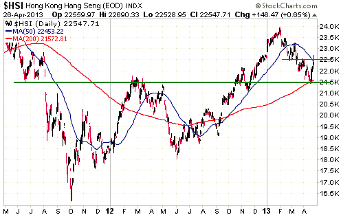
Hong Kong's Hang Seng Index (HSI) tested
intermediate-term lateral support and its 200-day MA during the week before
last. At that point it was 'oversold'. It has since rebounded to short-term
lateral resistance and its 50-day MA. It is not yet 'overbought', but it is no
longer 'oversold'.
We have no opinion on what the HSI will do over the weeks ahead. What we do know
is that taking out support at 21,500 would confirm that an intermediate-term
peak was put in place early this year, which would have bearish implications for
the stock markets -- the US stock market being the prime example -- that have
continued to trend upward.
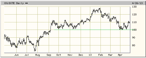
SX7E, a proxy for euro-zone bank stocks, has rebounded since testing support at
100. We suspect that it is in the process of completing a multi-month topping
pattern, but a solid break below 100 is needed to confirm this suspicion. Note
that the topping pattern could entail 1-2 more months of sideways range-trading.
This week's
important US economic events
| Date |
Description |
| Monday Apr 29 |
Personal Income and Spending
Pending Home Sales
Dallas Fed Mfg Survey | | Tuesday
Apr 30 |
Chicago PMI
Employment Cost Index
Case-Shiller Home Price Index
Consumer Confidence | | Wednesday
May 01 |
FOMC Statement
ISM Index
Motor Vehicle Sales
Construction Spending | | Thursday
May 02 |
International Trade Balance
Q1 Productivity and Costs
|
| Friday May 03 |
Monthly Employment Report
Factory Orders
ISM Non-Mfg Index |
Gold and
the Dollar
Gold
The COT's strangeness disappears
In last week's Interim Update we commented that one of the strangest aspects of
the recent gold market action was the lack of change in the Commitments of
Traders (COT) data. We concluded our discussion as follows: "...we would have
expected such a large price decline to have been accompanied by substantial
reductions in the speculative net-long and commercial net-short positions. If
anyone has a plausible explanation for why the COMEX positioning was almost
unchanged, we'd like to hear it."
Our request for explanations prompted many responses, for which we are thankful,
but none of the responses explained the situation. We have noted many times in
TSI commentaries over the years that in the gold market the large speculators
constitute the relatively smart money, but only with regard to being in synch
with the major trend (the large speculators were relentlessly net-short during
gold's long-term bear market and have been relentlessly net-long since the early
days of gold's long-term bull market). Large speculators, as a group, still tend
to be wrong at important turning points in the gold market, in that their
net-long position tends to bottom-out near lows in the gold price and peak near
highs in the gold price. In fact, during the 10-year period prior to this month,
every sharp decline in the gold price was accompanied by a sharp decline in the
net-long exposure of large speculators, and every important low in the gold
price coincided with a relatively low level of the speculative net-long
position. That's why the recent COT situation was so strange. Between the 9th
April COT data and the 16th April COT data we had the largest 5-day price
decline of the past three decades, and yet there was almost no change in the
net-long position of large speculators. This meant that something was very
different this time. None of the explanations we read came close to explaining
why.
The point is now moot, because the latest COT report removes the discrepancy
between what the speculative net position should be based on the historical
record and what it actually is. The change in the speculative net-long position
between 9th April and 16th April doesn't make sense and neither does the change
in the speculative net-long position between 16th April and 23rd April, but the
27% plunge in the speculative net-long position during the two-week period from
9th April to 23rd April is what we would expect given the $170/oz (11%) plunge
in the gold price over the same period. Perhaps there was a data collection
problem at the CFTC over the past couple of weeks that prevented the effects of
the 12th-15th April price crash from being reflected in the 16th April COT data.
In any case, the COT data are now consistent with other measures of gold-market
sentiment.
Before leaving the COT situation it is worth mentioning that the small traders
(the "non-reportable" traders in the COT data) are now roughly net-flat gold
futures. The only other time over the past 10 years that the small traders were
net-flat was at the 2008 crash low.
Current Market Situation
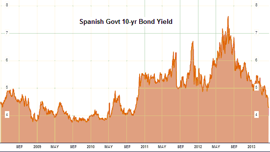
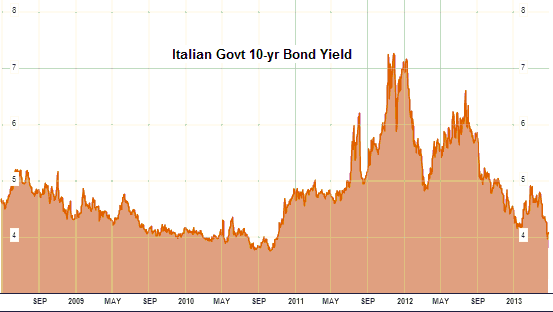
A bond market development that has some relevance to gold is illustrated by the
following Bloomberg.com charts. The charts show that the yields on 10-year
Spanish government bonds and 10-year Italian government bonds have recently
dropped to their lowest levels since late-2010. This tells us that the
euro-zone's government debt crisis is not expected to resume anytime soon.
A number of fundamental developments made gold vulnerable, but, as we mentioned
last week, fundamentals cannot possibly explain the severity of the recent gold
price decline. By the same token, fundamentals couldn't explain the sudden rise
in the silver price from $30/oz to $50/oz during March-April of 2011. These
events were driven by sentiment and leverage and momentum-trading.
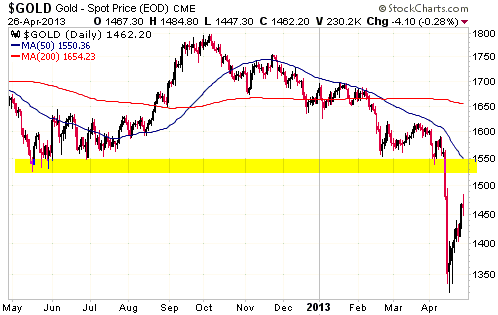
Gold's initial rebound from its 16th April low might have ended in the
mid-$1480s on Friday 26th April. The initial rebound was stronger than we
thought it would be, thus increasing the probability that the next decline will
make a higher low. That being said, it still wouldn't surprise us if gold
dropped back as far as $1350 before resuming its post-crash recovery.
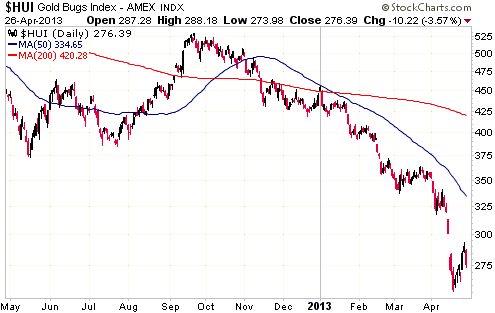
Gold Stocks
At the risk of sounding like a broken record, there still isn't any evidence
that the HUI has made a sustainable bottom. Evidence of a sustainable low would
have emerged if the HUI had built on last Wednesday's sharp rise during the
final two trading days of the week, but that didn't happen.
Our opinion is that the HUI has either bottomed or will bottom within the next
couple of weeks at only slightly below the mid-April low. From a cyclical
perspective, the ideal price action would involve a short-lived spike below the
April low during the first half of May. This would be ideal because it would set
the stage for an important turning point during a time-window when important
gold-sector turning points have often occurred in the past.
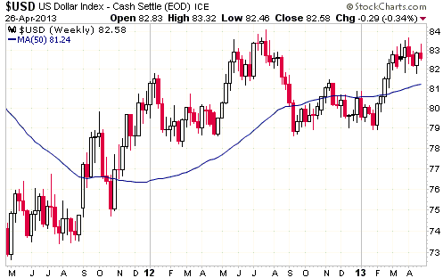
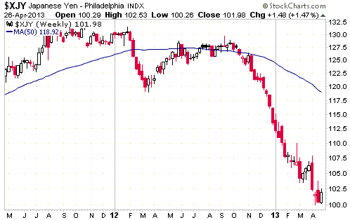
Currency Market Update
Weekly charts of the Dollar Index and the Yen are displayed below.
The Dollar Index has been in consolidation mode since early March. Nothing has
changed over the past couple of weeks, despite the drama in the commodity
markets.
We expect that at some point over the next few months the Dollar Index will
break above last year's high and begin making its way up to the 90s, but a
sustained break above last year's probably won't happen until after the senior
US stock indices commence multi-month declines. To put it another way, it will
probably take significant stock market weakness to create enough of a 'flight to
safety' to push the Dollar Index above last year's high.
Significant stock market weakness could begin at any time, but until it does the
Dollar Index will probably remain in consolidation mode.
Like the Dollar Index, the Yen is a probable future beneficiary of stock market
weakness. Actually, Yen strength is likely to be both a cause and an effect of
the next significant stock market decline in the same way that Yen weakness has
been both a cause and an effect of the stock market's rise over the past four
months.
Unlike the Dollar Index, the Yen is extremely 'oversold'. Also, Yen futures have
just reversed upward after testing 'round number' support at 100. This gives the
Yen more short-term upside potential than the Dollar Index.
Speculators should consider buying the Yen for a short-term trade below 102
(basis the nearest futures) and placing an initial stop just below 100.
Update
on Stock Selections
Notes: 1) To review the complete list of current TSI stock selections, logon at
http://www.speculative-investor.com/new/market_logon.asp
and then click on "Stock Selections" in the menu. When at the Stock
Selections page, click on a stock's symbol to bring-up an archive of
our comments on the stock in question. 2) The Small Stock Watch List is
located at http://www.speculative-investor.com/new/smallstockwatch.html
 Company
news/developments for the week ended Friday 26th April 2013: Company
news/developments for the week ended Friday 26th April 2013:
[Note: FS = Feasibility Study, IRR = Internal Rate of Return, MD&A =
Management Discussion and Analysis, M&I = Measured and Indicated,
NAV = Net Asset Value, NPV(X%) = Net Present Value using a discount
rate of X%, P&P = Proven and Probable, PEA = Preliminary Economic
Assessment, PFS = Pre-Feasibility Study]
*Endeavour Mining (EDV.TO, EVR.AX) announced that construction of
its 100K-oz/yr Agbaou mine in Cote d'Ivoire was on budget and on
track to be complete at the end of this year, with the first gold to
be poured early in 2014. Bringing Agbaou into production is expected
to result in total 2014 production -- from four operating gold mines
in West Africa -- of around 450K ounces.
*Energy Fuels (EFR.TO) announced that the Radioactive Materials
License for its proposed Pinon Ridge uranium mill had been
re-issued.
As we said on 4th March: "Due to EFR's purchase in mid-2012 of
the White Mesa mill, obtaining the licence for the proposed Pinon
Ridge mill is not critical to EFR's success. However, a favourable
decision on the licence will be important because it will protect
EFR's investment in Pinon Ridge's design and approval and give the
company an asset that will become very valuable during uranium's
next bull market."
EFR now owns the only in-production conventional uranium mill in the
US and the only licence to build a new mill. All it needs is a
cyclical bull market in the uranium price.
*Evolution Mining (EVN.AX) issued its March quarter results.
Gold production during the quarter was 84K ounces, which was about
5K ounces less than planned. According to the company, the shortfall
was mainly due to the effects of a cyclone on its Queensland
operations. The lower production resulted in per-ounce costs being
much higher than planned. The cash cost and the all-in cost were
A$918/oz and A$1353/oz, respectively.
Production during the current (June) quarter is expected to be
greater than 100K ounces at a much lower cost (our guess is that the
cash cost will be A$780/oz or lower in the June quarter).
Operating cash-flow during the March quarter was $50M, but this was
offset by $76M of capex ($33M for the development-stage Mt Carlton
project and $43M spread across the four operating mines), $5.6M of
exploration expenses, $7M of corporate costs and $2.7M of interest.
The upshot is that EVN consumed about $41M of cash including the Mt
Carlton development and $8M of cash excluding the Mt Carlton
development.
Mt Carlton is almost complete and should therefore not be a
significant drain on the company's cash in the future, although it
probably won't start making a meaningful positive contribution to
cash flow until the September quarter.
No balance sheet was included in the quarterly report, but based on
the information that was provided it seems that EVN has about $38M
of working capital and $93M of undrawn credit (on a $200M long-term
credit facility). It is therefore still in reasonable financial
shape, despite a disappointing performance during the March quarter.
As noted above, the June quarter should be much better.
*International Tower Hill Mines (THM, ITH.TO) issued a press
release containing the following statement:
"The Company has prepared for the potential of a continuing lower
gold price and has developed an alternate work program under which
ITH will continue to fund its corporate activities, compliance
matters and essential environmental baseline activities to support
the permitting process with the capital currently on hand.
Accordingly, the Company does not anticipate raising additional
capital in the near term and will continue to seek strategic
alliances to fund the future development of this project upon the
completion of the FS currently underway."
That is, THM has reduced its rate of spending in recognition of the
current market environment. Due to its ultra-depressed stock price,
it doesn't actually have any choice. A strategic alliance with a
large mining company (Anglogold?) would be the optimum way forward,
but such alliances are difficult for exploration-stage juniors to
negotiate right now because the large mining companies are trying to
reduce their commitments.
The press release didn't include any useful information, such as
whether the FS for the large low-grade Livengood gold project was
still on track for June-2013 completion. The FS will provide the
first indication of the economics of developing Livengood into a
mine, the reasons being that the company bypassed the PFS phase and
the PEA completed in August-2011 is no longer relevant (due to
substantial changes in mine plan and costs).
*Pretium Resources (PVG) announced that it had raised $40M by
selling 5.8M new shares to Liberty Metals and Mining (LMM) at
C$6.92/share. This was a good deal for LMM, as it has been able to
purchase a 5% stake in one of the best undeveloped gold deposits in
the world near the lowest prices of the past 2 years. It was also a
reasonable deal for PVG, because a) the stock price was about 10%
below the financing price when the deal was completed, and b) it was
important to ensure that the company had plenty of cash to complete
its high-cost 2013 work program at the Brucejack project, even if
doing so resulted in some dilution of the stock.
The high cost of the 2013 work program is largely due to the
extraction (from hundreds of metres below the surface) and testing
of a 10,000-tonne bulk sample. This will happen over the next few
months and will probably determine the level of interest of major
mining companies in making a takeover bid for PVG. Considering the
>10M-oz size and the unusually high grade of the Brucejack
underground gold deposit, if the bulk sample confirms decent
continuity of the resource then all of the major North American gold
miners will probably want to own this deposit.
*Ramelius Resources (RMS.AX) issued its March quarter results.
RMS's Mt Magnet gold mine performed poorly during the quarter.
Production was 14.5K ounces, which was well below plan, and the cash
cost was A$1396/oz, which was well above plan. The reason,
apparently, was that mining was adversely affected by rain and an
unscheduled mill shutdown during Jan-Feb. Production during March
improved to 5.8K ounces.
The March quarter was salvaged to some extent by 6K ounces of
production at a very low cash cost of A$296/oz at the Wattle Dam
mine. This should be the final production from Wattle Dam, as the
mine is fully depleted and stockpiles have now been worked off.
One of the most interesting aspects of RMS's latest quarterly report
was a note that the company had purchased gold put options with a
strike price of A$1350/oz (US$1375/oz) covering 6K ounces/month of
production for the next five months. This is the type of hedging we
like to see, as it protects the company against a large short-term
decline in the gold price without reducing its ability to benefit
from gains in the gold price.
We are concerned that RMS has not yet brought Mt Magnet's production
costs down to an acceptable level, but for the following reasons it
makes sense to stick with the stock:
1) The balance sheet remains strong, with about $48M (0.14/share) of
cash + gold.
2) Put options ensure that RMS will receive a minimum of A$1350/oz
for its production until August-2013.
3) The high-grade Western Queen mine will start contributing to
production during the September quarter, helping to reduce costs.
4) Mt Magnet achieved record production during the month of
March-2013, suggesting that the teething problems with this
operation are close to being resolved.
Chart Sources
Charts appearing in today's commentary
are courtesy of:
http://stockcharts.com/index.html
http://www.bloomberg.com/
http://bigcharts.marketwatch.com/

|
