![]()
![]()
![]()
![]()
-- Weekly Market Update for the Week Commencing 30th April 2018
Big Picture
View
Here is a summary of our big picture
view of the markets. Note that our short-term views may differ from our
big picture view.
The BULL market in US Treasury Bonds that began in the early 1980s ended in mid-2016, but there will be many years of topping action in bond prices and bottoming action in bond yields before major new trends get underway. A major decline in government bond prices will unfold during the 2020s. (Last update: 11 September 2017)
The stock market, as represented by the S&P500 Index, commenced a secular BEAR market during the first quarter of 2000, where "secular bear market" is defined as a long-term downward trend in valuations (P/E ratios, etc.), gold-denominated prices and inflation-adjusted prices. This secular trend will bottom in 2020 or later. (Last update: 11 September 2017)
A cyclical BEAR market in the US Dollar began in 2016-2017. (Last update: 11 September 2017)
Gold commenced a secular bull market relative to all fiat currencies, the CRB Index, bonds and most stock market indices during 1999-2001. This secular trend will peak in 2020 or later. (Last update: 11 September 2017)
Commodities,
as represented by the CRB Index, commenced a
secular BULL market in 2001 in nominal dollar terms. The first major
upward leg in this bull market ended during the first half of 2008, but
a long-term peak won't occur until 2020 or later.
(Last
update: 11 September 2017)
Copyright
Reminder
The commentaries that appear at TSI
may not be distributed, in full or in part, without our written permission.
In particular, please note that the posting of extracts from TSI commentaries
at other web sites or providing links to TSI commentaries at other web
sites (for example, at discussion boards) without our written permission
is prohibited.
We reserve the right to immediately
terminate the subscription of any TSI subscriber who distributes the TSI
commentaries without our written permission.
True
Fundamentals Summary
[Notes:
1) The date shown next to the current True Fundamentals Model (TFM) signal is
when the most recent change occurred. 2) Charts of the Gold and Equity
TFMs are included in the "Charts and Indicators" section of the TSI web
site]
| Market | True Fundamentals Model (TFM) |
| Gold (US$ Price) | Bearish (12 Jan 2018) |
| US Equity (SPX) | Neutral (20 Apr 2018) |
| Currency (Dollar Index) | Bullish (27 Apr 2018) |
| Commodities (GNX) | Neutral (20 Apr 2018) |
Last week's posts at the TSI Blog
Which political team do you support?
Summary of current
thinking/positioning
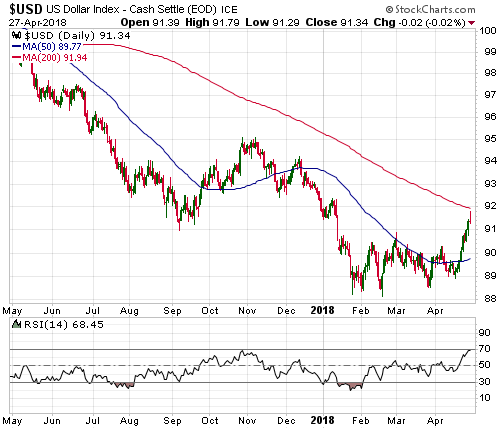
1) The Dollar Index has broken
upward from its trading range, but the remaining short-term upside could
be less than one point.
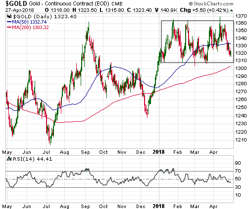
2) The US$ gold price looks set to test the
bottom of its $1309-$1363 trading range. A downside breakout from this
range is a realistic possibility, but a large price decline is not likely.
3) The SPX is about to either end its correction or escalate the
significance of the January-2018 top by breaking to a new low for the
year. The former outcome is the more likely, but mainly due to rising
interest rates there remains the threat of a trend-ending plunge to a new
low for the year.
4) The multi-year upward trend in commodity
prices that got underway in early-2016 appears to have resumed. If so, the
Australian and Canadian dollars should be relatively strong over the next
few months.
5) The T-Bond came close to a downside breakout last
week and is at risk of breaking out to the downside in the near future.
This could lead to a rapid additional decline, but in terms of time the
bond market is probably close to a multi-month bottom.
6) Holding a
cash reserve of around 30%.
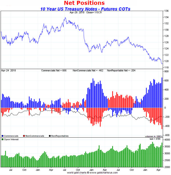
COT Extremes
Like all sentiment indicators,
the Commitments of Traders (COT) numbers only provide actionable
information at extremes or when they diverge in a big way from the market
price. Most of the time they can be safely ignored. Currently, three of
the markets we follow have COT situations that are worth highlighting.
The first is the 10-year T-Note futures market, where the total
speculative net-short position (the mathematical equivalent of the
commercial net-long position, which is indicated by the blue bars in the
middle section of the following chart) just hit an all-time high. This
suggests that speculators, as a group, are now more bearish on the 10-year
T-Note (more bullish on the 10-year interest rate) than they have been in
decades.
As a consequence, there is now a lot of 'short-covering
fuel' to power a rally in the 10-year T-Note. This doesn't mean that a
rally will begin soon, but it's the main reason that we are not interested
in placing a new bet against the T-Note at this time.
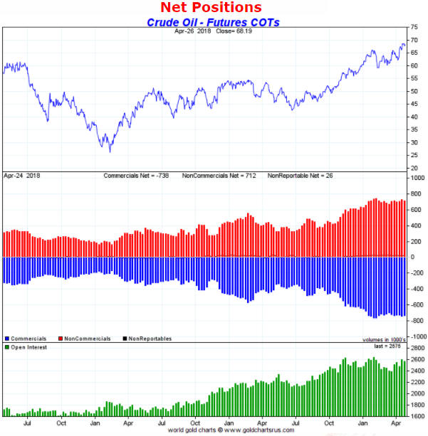
The second COT situation worth highlighting is in the US oil futures
market, where the total speculative net-long position reached an all-time
high late last year and has since remained at an extreme level. This warns
of downside price risk, although, as we've warned numerous times over the
past 5 months, the downside risk in the oil price is mitigated by bullish
fundamentals (demand in the physical market remains strong relative to
supply).
The evolution of oil's COT situation illustrates one of
the weaknesses of sentiment as a market timing tool. Due largely to the
supportive fundamental backdrop, the upward trend in the oil price
continued over the past several months despite relentless optimism on the
part of the speculating community.
At some point the unwinding of
the massive speculative net-long position in oil futures will fuel a large
decline in the oil price. That most likely will happen after the oil
market shifts out of backwardation.
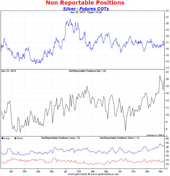
Turning to the silver market, the recent focus of many analysts was on
the reductions in the net positions of commercial traders and large
speculators to the point where both of these groups were effectively
net-flat. This was an unusual development that, at a superficial level,
pointed to the sentiment backdrop being very bullish for the silver price.
However, as pointed out in multiple TSI commentaries, deeper analysis of
silver's COT situation revealed two reasons to be cautious. One reason was
the high level of open interest. The other reason was the vigorous
optimism on the part of small speculators (the proverbial 'dumb money') as
evidenced by the rise in the net-long position of "NonReportable" traders
to a 9-year high.
The following chart indicates the net position of
small speculators in silver futures. It shows that the dumb money remains
very optimistic about the prospects for a rally in the silver price.
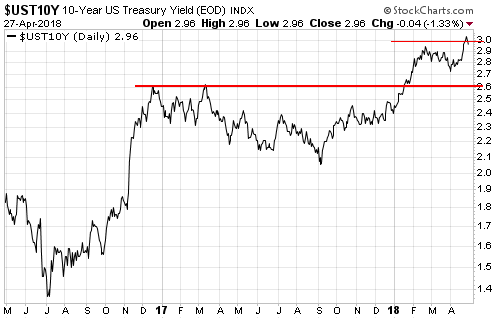
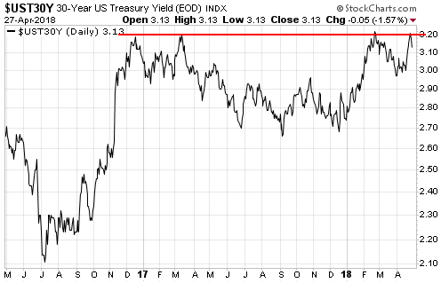
Interest Rates
and Bonds
During the first three days of
last week the 10-year T-Note yield broke above the
psychologically-important 3% level and the price of the 30-year T-Bond
broke below its February-2018 low to a new multi-year low. However,
neither breakout was confirmed by the weekly close. Also, at no time last
week did the 30-year T-Bond yield move above resistance defined by its
2016, 2017 and early-2018 highs.
The first of the following daily
charts shows last week's failed attempt by the 10-year T-Note yield to
break above the big round number (3.0%). The second chart shows the
30-year T-Bond yield's long-term resistance near 3.2%.
The rise in the nominal 10-year T-Note yield from its July-2016 major
bottom and from its September-2017 secondary bottom was partly a response
to rising inflation expectations, but higher inflation expectations were
only half the story. We know that this is the case because the above chart
reveals a roughly 1.6% increase in the nominal 10-year yield since the
July-2016 bottom while the chart displayed below reveals a roughly 0.8%
increase in the 'real' 10-year T-Note yield over the same period. In other
words, interest rates have been trending upward in both nominal and real
terms. (On a side note, the upward trend in the real interest rate has
been a source of downward pressure on the gold price).
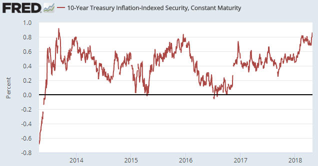
Expectations of stronger global economic growth were probably behind
the rise in the real T-Note yield during the second half of 2016, but it's
likely that the rise in the real T-Note yield over the past 7 months was
mostly driven by expectations of increased bond supply.
The
increase in US government bond supply may be less than feared over the
remainder of this year, though, due to the huge increase over the past few
months in the US Treasury's cash balance. The increase is illustrated by
the following weekly chart of the Treasury General Account (the US federal
government's bank account at the Fed). The chart shows that the cash
balance grew from below $100B late last year to a little over $400B on
25th April.
The Treasury probably needs a cash float of only
$50B-$100B, so there is currently $300B-$350B sitting in the Treasury
General Account that will in all likelihood be injected into the economy
within the coming 6 months. To put it another way, $300B-$350B of the
deficit spending that will be done by the US government over the next
several months can be funded without tapping the bond market.
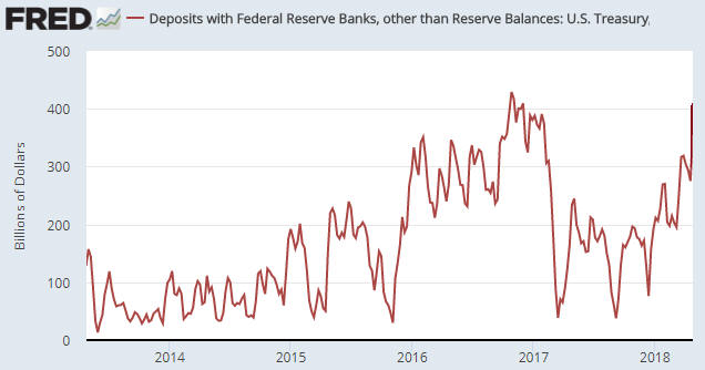
One-off corporate tax payments on money held outside the US is likely
the main cause of the large increase in the Treasury's cash reserve over
the past few months, but whatever the reason for the cash build-up the
drawing-down of the cash will reduce the most important recent source of
upward pressure on the 'real' T-Note yield. As a consequence, we think
that the real 10-year T-Note yield is close to its high for the year.
Productivity of
Debt
In the latest
Quarterly
Review and Outlook by Hoisington Investment Management (HIM) there's a
discussion about the falling productivity of debt. According to HIM, this
is evidenced by the rising trend in the amount of additional debt required
to generate an additional unit of GDP. There are some serious flaws in
this analysis, but before we get to these flaws here is the relevant
excerpt from HIM's report:
"The law of diminishing returns is
already evident in all major economies as well as on a global scale (Table
1). Global GDP generated per dollar of total global public and private
debt dropped from 36 cents in 2007 to just 31 cents in 2017. Diminishing
returns is even more apparent in the case of China's public and private
debt, largely internally owned. In terms of each dollar of debt, China
generated 61 cents of GDP growth in 2007 and only 33 cents last year. In
other words, in the past ten years the efficiency of China's debt fell
45%. Thus, even in a command and control economy, the law of diminishing
returns prevails. The most advanced sign of diminishing returns is in
Japan, the most heavily indebted major country, where a dollar of debt in
the last year produced only 22 cents of GDP growth. This economic
principle applies equally to businesses.
All economies rely heavily
on the business sector to lead the growth process. Yet, a sharp decline in
GDP per dollar of business debt occurred in the U.S. during the past nine
years, reinforcing the underlying trend since the early 1950's. In 1952,
$3.42 of GDP was generated for every dollar of business debt, compared
with only $1.39 in 2017. In the corporate sector, where capital as well as
technology is most readily available, GDP generated per dollar of debt
fell from $4.50 in 1952 to $2.50 in 2007 to $2.21 last year. The dismal
trend in productivity confirms this conclusion. The percent change for
productivity in the last five years (2017-2012) was equal to the lowest of
all five-year spans since 1952. It was also less than half the average
growth over that period."
There are three big problems with
the whole "it takes X$ of debt to generate Y$ of GDP" concept, the first
being that GDP is not a good indicator of the economy's size or progress.
For one thing, GDP is a measure of spending, not a measure of wealth
creation. It's possible, for example, for GDP to grow rapidly during a
period when wealth is being destroyed on a grand scale. This could happen
during war-time and it could also happen as the result of massive
government spending on make-work projects. It's also possible for GDP to
grow slowly at a time when the rate of economic progress is high. This can
happen because GDP is dominated by consumption. It omits all
business-to-business expenditure and misses a lot of value-adding
investment.
For another thing, GDP is strongly influenced by
changes in the money supply. Of particular concern, even though an
increase in the money supply cannot possibly cause a sustainable increase
in economy-wide wealth, it will usually boost GDP.
Therefore,
comparing anything with GDP is problematic.
The second flaw in the
"it takes X$ of debt to generate Y$ of GDP" concept is that it involves
comparing a flow (annual GDP) to a stock (the cumulative total of debt).
There are times when it can make sense to compare a stock to a flow, but
care must be taken when doing so. We'll use a hypothetical example to show
one of the pitfalls.
Assume that over the course of a year an
economy goes from a GDP of $10T and a total debt of $50T to a GDP of
$10.4T and a total debt of $52T. This could prompt the claim that it took
$2T of additional debt to boost GDP by $0.4T, or that $5 of additional
debt was needed for every $1 of additional GDP. However, it could also be
said that a 4% increase in debt was associated with a 4% increase in GDP.
The second way of expressing the same change seems far less worrisome.
In any case, the above two flaws in the typical productivity-of-debt
analysis pale in comparison with the third flaw, which is that the entire
concept of debt productivity is meaningless. The fact is that debt doesn't
cause economic growth and 'excessive debt' (whatever that is) doesn't
inhibit economic growth.
An economy can grow with or without an
increase in debt, because per-capita economic growth is caused by savings
and capital investment. An increase in debt can accelerate the pace of
real growth by acting as a means by which savings are channeled to where
they can be invested to the best effect, but the transfer of savings can
also occur via the exchange of money for equity. For example, most
exploration-stage mining companies and most technology start-ups are
equity-financed not debt-financed. There is, of course, debt that is used
to finance consumption rather than investment, but that type of debt can't
grow the economy over the long term because it necessarily involves a
present-future trade-off -- more spending in the present leads to less
spending in the future.
The central problem is unsound money, not
excessive debt. More specifically, the problem is that when banks make
loans they create money out of nothing. It's this creation of money out of
nothing and the subsequent exchange of nothing for something, not the
build-up of debt, that leads to reduced productivity. If all debt involved
the lending/borrowing of real savings then no amount of debt could ever
make the overall economy less efficient. Of course, if all debt involved
the lending/borrowing of real savings then the total amount of debt would
be a small fraction of what it is today.
The Stock Market
Cutting directly to the chase,
if there's a modicum of strength in the US stock indices early this week
we probably will re-establish a short-term bearish speculation via the
purchase of some QQQ June-2018 put options. It will be a small position
that most likely will be exited if new signs of weakness haven't emerged
by mid-May.
There are two reasons for our interest in buying some
short-dated puts, the first being that the most important US stock indices
bounced from critical support over the final three days of last week and
remain in precarious positions.
This situation was discussed in
last week's Interim Update with regard to the S&P500 Index (SPX). When we
wrote the Interim Update the SPX had just bounced from the vicinity of its
200-day MA and trend-line support. The bounce continued over the final two
days of the week, but it wasn't strong enough to significantly reduce the
danger of a downside breakout.
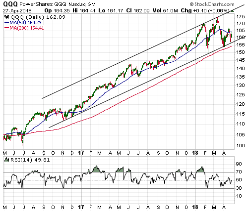
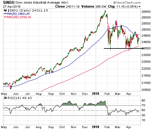
Below are three charts containing
other examples of indices or ETFs that are within spitting distance of
critical support. The first chart shows that the Dow Transportation
Average is close to the bottom of a well-defined channel that dates back
to the early-2016 low. The second chart shows that QQQ bounced off its
intermediate-term channel bottom last week and rebounded to, but not
through, its 50-day MA. The third chart shows that the Dow Industrials
Index ended last week about 3.5% from the edge of a virtual cliff (the
'cliff edge' lies at 23500).

The second reason for our interest in buying some short-dated puts is
the risk of a rapid additional decline in the bond market. There are good
reasons to expect that US government bond prices are close to multi-month
lows in terms of time, but a trend-ending plunge is a realistic threat.
A trend-ending plunge in the bond market would result in a few
weeks of turmoil in the stock market.
Just to be clear, the most
likely outcome is that the US stock indices do NOT experience solid breaks
below their critical support levels within the next few weeks. However, it
wouldn't take much additional weakness from here to breach these levels
and breaching them could precipitate a panic.
This week's
significant US economic events
[Notes:
1) The most important events
(to the markets) are shown
in bold. 2) A list of global economic events can be found
HERE]
| Date | Description |
| Monday Apr-30 |
Personal Income and Spending Chicago PMI Pending Home Sales |
| Tuesday May-01 |
Motor Vehicle Sales ISM Mfg Index Construction Spending |
| Wednesday May-02 | FOMC Announcement |
| Thursday May-03 |
International Trade Balance Q1 Productivity and Costs ISM Non-Mfg Index Factory Orders |
| Friday May-04 | Monthly Employment Report |
Gold and the Dollar