|
-- Weekly Market Update for the Week Commencing 31st March 2014
Big Picture
View
Here is a summary of our big picture
view of the markets. Note that our short-term views may differ from our
big picture view.
In nominal dollar terms, the BULL market in US Treasury Bonds
that began in the early 1980s ended in 2012. In real (gold)
terms, bonds commenced a secular BEAR market in 2001 that will continue
until 2018-2020. (Last
update: 20 January 2014)
The stock market, as represented by the S&P500 Index,
commenced
a secular BEAR market during the first quarter of 2000, where "secular
bear market" is defined as a long-term downward trend in valuations
(P/E ratios, etc.) and gold-denominated prices. This secular trend will bottom sometime between 2014 and 2020.
(Last update: 22 October 2007)
A secular BEAR market in the Dollar
began during the final quarter of 2000 and ended in July of 2008. This
secular bear market will be followed by a multi-year period of range
trading.
(Last
update: 09 February 2009)
Gold commenced a
secular bull market relative to all fiat currencies, the CRB Index,
bonds and most stock market indices during 1999-2001.
This secular trend will peak sometime between 2014 and 2020.
(Last update: 22 October 2007)
Commodities,
as represented by the Continuous Commodity Index (CCI), commenced a
secular BULL market in 2001 in nominal dollar terms. The first major
upward leg in this bull market ended during the first half of 2008, but
a long-term peak won't occur until 2014-2020. In real (gold) terms,
commodities commenced a secular BEAR market in 2001 that will continue
until 2014-2020.
(Last
update: 09 February 2009)
Copyright
Reminder
The commentaries that appear at TSI
may not be distributed, in full or in part, without our written permission.
In particular, please note that the posting of extracts from TSI commentaries
at other web sites or providing links to TSI commentaries at other web
sites (for example, at discussion boards) without our written permission
is prohibited.
We reserve the right to immediately
terminate the subscription of any TSI subscriber who distributes the TSI
commentaries without our written permission.
Outlook Summary
Market
|
Short-Term
(1-3 month)
|
Intermediate-Term
(6-12 month)
|
Long-Term
(2-5 Year)
|
|
Gold
|
Bullish
(26-Mar-14) |
Bullish
(26-Mar-12) |
Bullish
|
|
US$ (Dollar Index)
|
Neutral
(26-Mar-14) |
Bearish
(27-Jan-14) |
Neutral
(19-Sep-07) |
|
Bonds (US T-Bond)
|
Bullish
(11-Dec-13)
|
Neutral
(18-Jan-12)
|
Bearish |
|
Stock Market
(DJW)
|
Neutral
(03-Mar-14)
|
Bearish
(28-Nov-11) |
Bearish
|
|
Gold Stocks
(HUI)
|
Bullish
(03-Mar-14) |
Bullish
(23-Jun-10) |
Bullish
|
|
Oil |
Bearish
(12-Mar-14) |
Neutral
(31-Jan-11) |
Bullish
|
|
Industrial Metals
(GYX)
|
Neutral
(17-Feb-14) |
Neutral
(06-Jan-14) |
Neutral
(11-Jan-10) |
Notes:
1. The date shown below the current outlook is when the most recent outlook change occurred.
2. "Neutral", in the above table, means that we either don't have a
firm opinion or that we think risk and reward are roughly in balance with respect to the timeframe in question.
3. Long-term views are determined almost completely by fundamentals,
intermediate-term views by
fundamentals, sentiment and technicals, and short-term views by sentiment and
technicals.
Monetary Inflation Update
The ECB got around to publishing its
money-supply data for February late last week, enabling us to update our euro
and G2 (US plus euro-zone) True Money Supply (TMS) charts.
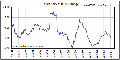
Our first chart shows the year-over-year (YOY) percentage change in euro TMS.
The ECB is coming under pressure to do more on the monetary inflation front, but
recently it hasn't done much. Over the past two months the YOY rate of change in
euro TMS flatlined at around 6%.
Note that while we have no opinion about the euro's likely performance on the
foreign exchange market over the weeks immediately ahead, we are
intermediate-term bullish on this currency (relative to the US$). The primary
reason is our expectation that the low valuations of European equities relative
to US equities will lead to outperformance by the former, boosting the
investment/speculative demand for the euro. A secondary reason is that despite
the Fed's "tapering" and the apparent intention of the ECB to do more on the
monetary inflation front, the ECB could end up doing less than needed, in the
face of substantial natural deflationary pressures, to create the sort of "price
inflation" that bad economists and central bankers believe to be beneficial.
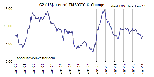
Our second chart shows the YOY percentage change in G2 TMS -- in our opinion the
most useful leading indicator of the global boom-bust economic cycle. The last
two economic busts commenced about 6 months after the annual growth rate of G2
TMS dropped to 5%. At around 7% the current growth rate is only slightly above
its low of the past 4 years, but still comfortably above the level that
ushered-in the previous two busts.
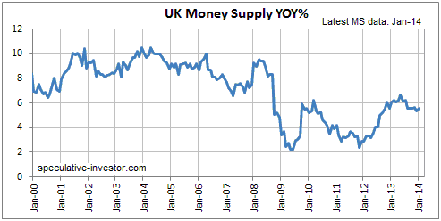
The UK's YOY rate of money-supply growth has been stable at 5.5%-6.5% for almost
18 months. This is inflationary, but not as inflationary as the money-supply
growth rates in many other countries. Also, the average rate of increase in the
supply of British Pounds was relatively low during 2009-2012. This goes part of
the way towards explaining the strength in the Pound's exchange rate over the
past 12 months and should continue to create a tail-wind for the Pound over the
coming 12 months.
Commodities
Copper Update
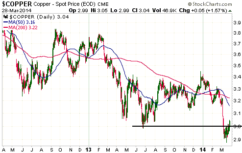
In the 10th March Weekly Update, we wrote:
"If the copper price breaks decisively below $3.00 and then quickly (within 2
weeks) moves back above $3.00, it would be a very bullish short and long term
price signal."
The following chart shows that the copper price broke decisively below $3.00 and
then quickly moved back above $3.00. We are watching with interest. IF copper
can achieve another weekly close above $3.00 then we will have preliminary
evidence that its multi-year bear market has ended.
Natural Gas - primed for a seasonal rally
Below is the seasonal natgas chart from
equityclock.com. The chart is based on 20 years of price history ending 31st
December 2013.
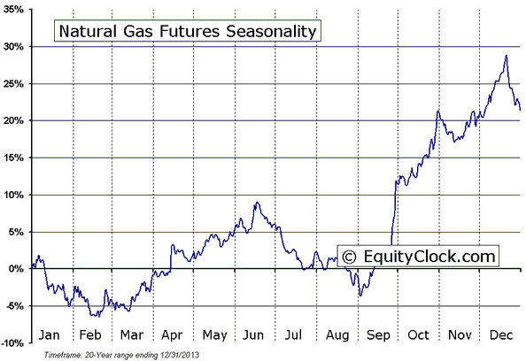
The natgas market was closely tracking its seasonal pattern until early January
of this year when extraordinarily severe winter weather in the US caused a huge
price rise. However, despite the dramatic price spike from $4.00 in early
January to $6.50 in February, a subsequent price plunge appears to have brought
the market back into line with its seasonal pattern (the seasonal pattern called
for a March low).
The natgas market has just entered a period of seasonal strength that continues
until mid June. Furthermore, the article linked
HERE explains that unusually low rig counts and inventory levels are set to
put upward pressure on the price over the months ahead, increasing the
probability that a rally will materialise over the coming 2-3 months as
predicted by the seasonal pattern.The Stock
Market
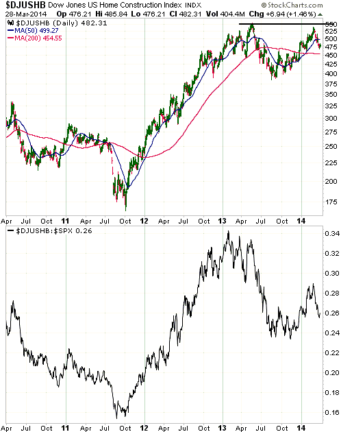
Today we are going to focus on relative
strength within the US stock market.
Our first chart shows the performance of the Dow Jones US Home Construction
Index (DJUSHB) on top and the performance of the DJUSHB/SPX ratio on bottom.
Notice that while DJUSHB peaked in nominal dollar terms in May-2013 and tested
its nominal peak in February-2014, relative to the broad market (represented by
the SPX) it peaked in January of 2013 and then made two lower highs before
plunging during May-September. Notice, as well, that when the nominal DJUSHB
tested its 2013 high in February of this year the DJUSHB/SPX ratio had only
retraced about half its 2013 decline.
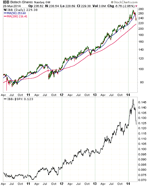
Our second chart shows the performance of the Biotech iShares ETF (IBB) on top
and the performance of the IBB/SPX ratio on bottom.
When the home-building sector began to underperform in early-2013, the biotech
sector began to accelerate upward in both nominal and relative terms. In other
words, it seems that the performance baton was passed from the home-building
sector to the biotech sector early last year. Notice, however, that while IBB
has experienced nothing more than a normal correction over the past few weeks in
dollar terms, relative to the SPX its decline has been dramatic. This suggests
that biotech's period of relative strength has ended, prompting the question: to
which sector or sectors will the baton now be passed?
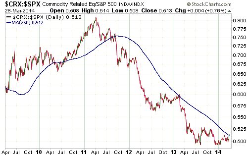
One of our expectations is that regardless of what happens in nominal terms,
after years of relative weakness commodity stocks are poised for relative
strength during 2014. If this relative strength materialises it will be
indicated via an upward trend in the CRX/SPX ratio (Commodity-Related Equities
versus the broad US stock market).
The following chart shows that the CRX/SPX ratio has moved up to its 250-day MA,
which is where the 2012-2013 counter-trend rebound ended. Additional strength
from here would be evidence of an intermediate-term trend reversal because it
would differentiate the current rebound from the earlier failed attempts to
reverse course.
The evidence is not yet definitive, but at this early stage it looks like the
commodity sector has grabbed the performance baton.
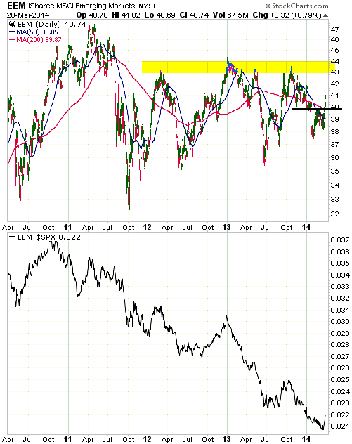
Our final chart shows the performance of the Emerging Markets ETF (EEM) on top
and the performance of the EEM/SPX ratio on bottom.
As is the case with commodity-related equities, signs are beginning to appear
that emerging-market equities are shifting from relative weakness to relative
strength. Last week, for instance, EEM broke above well-defined resistance at
$40 and the EEM/SPX ratio had its best week since the third quarter of last
year. From a fundamental perspective the recent strength in EEM makes less sense
than the recent strength in CRX, but it isn't uncommon for the obvious
fundamentals to lag at important turning points for market prices.
This week's
important US economic events
| Date |
Description |
| Monday Mar 31 |
Chicago PMI
Dallas Fed Mfg Survey | | Tuesday
Apr 01 |
Construction Spending
ISM Mfg Index
Motor Vehicle Sales | | Wednesday
Apr 02 |
Factory Orders | | Thursday
Apr 03 |
Trade Balance
ISM Non-Mfg Index
|
| Friday Apr 04 |
Monthly Employment Report |
Gold and
the Dollar
Gold and Silver
The Gold/Silver Ratio
Although we most recently discussed the long-term performance of the gold/silver
ratio only two months ago, the subject is sufficiently important to warrant some
repetition.
With reference to the following monthly chart of the gold/silver ratio, here are
the main points we made in our 4th February commentary:
First, silver tends to perform better than gold -- causing the gold/silver ratio
to decline -- during the late stages of intermediate-term precious-metals
rallies and especially during the late stages of cyclical precious-metals bull
markets. It does so for the same reason that highly-speculative junior
gold-mining stocks tend to be much stronger than their larger/lower-risk
counterparts during the late stages of multi-year advances. As a rally
progresses, speculators are emboldened to take more risk and go further down the
food chain in search of the proverbial killing.
Second, over the past 50 years gold has performed better than silver -- causing
the gold/silver ratio to rise --during the first two years of each cyclical
precious-metals bull market that has occurred within a secular bull market.
Specifically, gold outperformed silver from mid-1971 through to mid-1973, from
mid-1976 through to late-1978, and from early-2001 through to mid-2003 (the
three periods shown in the boxes labeled A, B and C on the following chart).
Third, 50-65 now appears to be the normal range for the gold/silver ratio.
Spikes in the ratio to below 50 now indicate that silver is 'overbought'
relative to gold on a long-term basis and that a precious-metals rally is in its
final phase, whereas rises in the ratio to above 65 suggest that the entire
precious-metals sector is 'oversold' on a long-term basis and that investors
with a timeframe of at least two years should be favouring silver over gold.
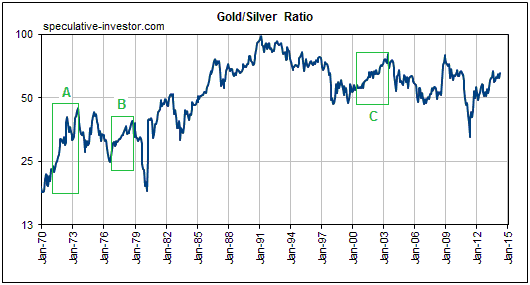
So, the historical record shows gold outperforming silver during the first two
years of new cyclical bull markets. The implication is that if a new cyclical
bull market began in late-June of 2013 (we strongly believe it did) then silver
will maintain a downward bias relative to gold until the second half of next
year.
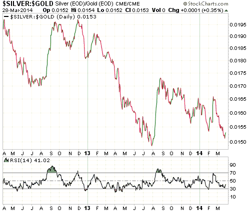
However, the ratio ended last week at the top of its normal range -- a level
where silver is 'oversold' relative to gold on a long-term basis and a lot
higher than it was in the early stages of the previous cyclical bulls. This
suggests that long-term investors should now have a bias in favour of silver. It
is also worth pointing out that silver is now 'oversold' relative to gold on a
short-term basis, as indicated by the low level of the RSI shown at the bottom
of the following daily chart of the silver/gold ratio.
Our conclusion is the same as it was two months ago: we are long-term neutral on
the gold/silver ratio. That being said, for our own account we continue to be
more interested in accumulating silver bullion than gold bullion, solely because
we have a lot of equity-related exposure to gold and very little equity-related
exposure to silver.
Current Market Situation
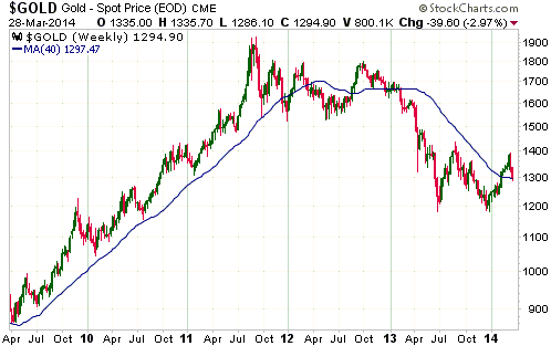
Gold traded as low as $1286 last week and ended the week at $1295. The $100
decline in price from the March high to the March low was undoubtedly
gut-wrenching for many gold investors, but it still looks like a routine
pullback.
Like most sharp price moves in major financial markets, gold's recent decline
had a lot more to do with sentiment than fundamentals. It was set in motion by
the quick $40 increase on the back of the Ukraine conflict. This $40 increase
was always going to be retraced in full, but the price decline prompted
additional selling as stops were hit and short-term traders fled the 'long' side
of the market.
The following weekly chart shows that gold ended last week just below its
40-week MA. This is also just below the confluence of daily moving averages that
we had identified as a likely target for a correction low. As noted in last
week's Interim Update, the fact that this target was reached during the
correction's initial decline probably means that lateral support at $1275-$1280
will be tested before the overall correction is complete.
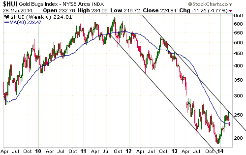
Gold Stocks
In last week's Interim Update, we wrote:
"The price pattern for the gold-stock indices will end up looking similar to
that of gold bullion, but what we should see as the correction progresses is
resilience in the mining stocks. This will ideally lead to a bullish
non-confirmation, with new correction lows in gold not being confirmed by new
correction lows in the HUI and the XAU."
We saw some resilience and a small bullish non-confirmation over the final two
trading days of last week, in that the HUI rose from 219 to 225 while the
bullion price fell from $1305 to $1295. This non-confirmation probably signaled
the end of the first leg of the correction, but last week's lows or whatever new
lows are made early this week will most likely have to be tested following a
rebound.
As new information becomes available it will sometimes be necessary to re-draw
channel lines on charts. For example, whereas two weeks ago it looked like the
move above 250 had broken the HUI above the top of its long-term channel, due to
subsequent price action we now think it makes more sense to draw the channel as
illustrated on the following weekly chart. The blue line on the chart is the
40-week MA.
The HUI's February-2014 break above its 40-week MA differentiated the rally that
began in December-2013 from the counter-trend rebound of July-August 2013, but
the inability to sustain the move above the 40-week MA and break above the
channel top means that the latest rally fell short of differentiating itself
from the multi-month counter-trend rebound of 2012. The next weekly close above
250 will provide the required differentiation and eliminate almost all the
residual doubt -- in our case, a very small amount of doubt -- that a new
cyclical bull market began in December-2013.
The Currency Market
The Senior Commodity Currencies
Last week the A$ closed above its 200-day MA for the first time since last April
and the C$ closed above its 50-day MA for the first time since last October. The
A$ signaled an intermediate-term upward reversal several weeks ago, but last
week's break above the 200-day MA solidifies the reversal. The C$ provided an
early warning that its trend was reversing upward when it failed to
follow-through on its mid-March downside breakout. Last Thursday's break above
the 50-day MA was a more definitive warning.
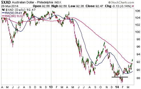
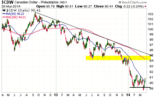
We expect that the senior commodity currencies will make progressively higher
highs and higher lows over the months ahead, with the pullbacks to higher lows
generally coinciding with periods of stock market weakness.
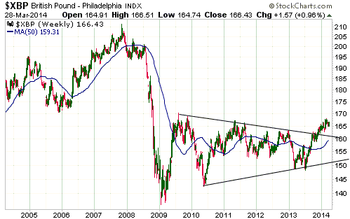
The Pound
As indicated by the following weekly chart, the British Pound has been very
strong since mid-2013. It is reasonable to expect that this strength (relative
to the US$) will continue for many more months, but a decline to the vicinity of
the 50-week moving average (160-162) would be required to create a new buying
opportunity.
Updates
on Stock Selections
Notes: 1) To review the complete list of current TSI stock selections, logon at
http://www.speculative-investor.com/new/market_logon.asp
and then click on "Stock Selections" in the menu. When at the Stock
Selections page, click on a stock's symbol to bring-up an archive of
our comments on the stock in question. 2) The Small Stock Watch List is
located at http://www.speculative-investor.com/new/smallstockwatch.html
 Company
news/developments for the week ended Friday 28th March 2014: Company
news/developments for the week ended Friday 28th March 2014:
[Note: AISC = All-In Sustaining Cost, FS = Feasibility Study, IRR =
Internal Rate of Return, MD&A = Management Discussion and Analysis,
M&I = Measured and Indicated, NAV = Net Asset Value, NPV(X%) = Net
Present Value using a discount rate of X%, P&P = Proven and
Probable, PEA = Preliminary Economic Assessment, PFS =
Pre-Feasibility Study]
*Almaden Minerals (AAU) issued its mandatory reports (financial
statements and MD&A) for the quarter and year ended 31st December
2013. The reports showed that AAU had about $12M of working capital
at the end of last year, which should be enough to fund the company
through to at least the end of this year.
The next important milestone for AAU is expected to be the
completion of the PEA for its Tuligtic gold-silver project in
Q2-2014.
*Energy Fuels (EFR.TO, UUUU) issued its mandatory reports
(financial statements and MD&A) for the quarter and year ended 31st
December 2013. The reports showed that EFR had about $33M of working
capital at the end of last year. The company has subsequently been
able to free-up about $12M of restricted cash, so its working
capital should now be around $45M.
EFR, a junior uranium producer with operations that are leveraged to
changes in the uranium price, has put a number of mines on standby
and reduced its production to the minimum pending a stronger market
for uranium.
*Lydian International (LYD.TO) issued its mandatory reports
(financial statements and MD&A) for the quarter and year ended 31st
December 2013.
The reports showed that LYD had about $8M of working capital at the
end of last year. Accounting for subsequent spending and equity
financings, the company should now have about $28M of working
capital (including the $4.7M to be received by early April from the
latest equity financing). This should be more than enough to take
the company through to the point where it makes a decision to build
a mine at its Amulsar project in Armenia.
The next piece of important news for LYD is expected to be the
announcement of the revised FS results during Q2. If the FS reveals
positive economics at $1300/oz (it probably will) and the permits
needed to build a mine are received, then the company will become a
likely candidate for a takeover bid.
*Premier Gold (PG.TO) reported results from its latest drilling
program at the Trans-Canada gold project's Hardrock deposit. The
main purpose of the drilling was to prove the continuity of what is
already a large resource, thus enabling the conversion of Inferred
resources to M&I resources. The results reported last week suggest
that the drilling has achieved its intended purpose and might also
have identified a higher-grade core in part of the deposit.
The project currently has a total defined resource of about 7M
ounces, but at this time the primary focus is the open-pitable
portion of the deposit. This portion was the subject of the PEA
completed in January and currently has 2.35M Indicated ounces plus
0.86M Inferred ounces. According to the PEA, the economics of the
Hardrock's open-pit mine would be marginally positive at $1250/oz
and robust at $1450/oz (a 16% increase in the gold price from $1250
to $1450 boosts the project's after-tax NPV by 76%).
The next scheduled milestone for PG's Trans-Canada project is a
resource update in the second quarter of this year.
*Rio Alto Mining (RIOM, RIO.TO) issued its mandatory reports
(financial statements and MD&A) for the quarter and year ended 31st
December 2013. The reports showed that RIOM had about $48M of
working capital and no long-term debt at the end of last year.
RIOM had net income of $31M ($0.17/share) for the full year and $10M
($0.06/share) for the final quarter of last year. We calculate that
it only generated free cash flow of around $3M during the final
quarter of last year, which is less than expected thanks to a $20M
tax payment to the government of Peru. However, it should be viewed
as a plus that the company was still able to generate some cash
during a quarter when it had a $20M tax payment and when the average
gold price was only $1237/oz.
As well as reporting last year's financial results, RIOM provided
updated guidance for 2014. The gold production forecast for this
year has increased from 190K-210K to 200K-220K ounces. Considering
the track record of RIOM's management, this suggests that 2014
production will be more than 220K ounces.
RIOM is one of the few gold producers that will be generating
meaningful net income and free cash flow at the current gold price.
It is an obvious candidate for new buying during the current
weakness.
*Sabina Gold and Silver (SBB.TO) issued its mandatory reports
(financial statements and MD&A) for the quarter and year ended 31st
December 2013. The reports showed that SBB had about $59M of working
capital at the end of last year. This should be enough to fund the
company through to at least the end of this year, although a
detailed work plan and budget for 2014 have not yet been provided.
What we know is that SBB plans to complete optimisation studies and
metallurgical tests during Q1-2014 in preparation for the start of a
Feasibility Study in Q2.
List
of candidates for new buying
From within the ranks of TSI stock selections, the best candidates for new
buying at this time are:
1) AAU (last Friday's closing price: US$1.37).
2) PG.TO (last Friday's closing price: C$1.95).
3) PLG.TO (last Friday's closing price: C$1.45).
4) RIOM (last Friday's closing price: US$2.04). RIOM gained 6% last week despite
the sector-wide decline. We suspect that the opportunity to buy RIOM near or
below US$2 will soon disappear forever, although many gold-mining 'investors'
remain quick to panic and this susceptibility to panic could possibly create
even better buying opportunities over the weeks ahead. The susceptibility to
panic is understandable given that many participants in this market are
influenced by promoters of the theory that the gold price usually does whatever
a cartel of banks wants it to do. If we thought this theory was valid then we
would also be quick to panic. Actually, that's not true. If we thought this
theory was even half right then we would not own any gold-related investments.
Is
it worth adding a new Kinross Gold (KGC) trading position?
The short-term KGC trading position in the TSI List was stopped out last Monday.
The stock price subsequently fell much further and made a new multi-year low
last Thursday before rebounding on Friday. It is now very 'oversold' in addition
to being very under-valued relative to the stocks of other senior gold
producers, prompting the question: should we add a new KGC trading position to
the TSI List?
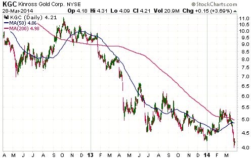
We are thinking about it, but at this time we are going to stay on the
sidelines. There's a good chance that KGC will recover more quickly than most
other gold stocks once the current correction runs its course, but we can't
quantify the Russia-related risk.
Russia-related risk is the main reason we haven't been interested in KGC as a
long-term holding up until now despite its relatively low valuation and decent
balance sheet (KGC's most profitable mining assets are in Russia). This risk
moved to centre-stage last week due to fears that Putin will retaliate against
"Western" sanctions and provocative political rhetoric by seizing assets owned
by Westerners.
We strongly doubt that Putin will react in such a way, but for the moment KGC
has become too difficult.
Chart Sources
Charts appearing in today's commentary
are courtesy of:
http://stockcharts.com/index.html

|
