|
- Interim Update
4th February 2015
Copyright
Reminder
The commentaries that appear at TSI
may not be distributed, in full or in part, without our written permission.
In particular, please note that the posting of extracts from TSI commentaries
at other web sites or providing links to TSI commentaries at other web
sites (for example, at discussion boards) without our written permission
is prohibited.
We reserve the right to immediately
terminate the subscription of any TSI subscriber who distributes the TSI
commentaries without our written permission.
Yearly
Forecast
In TSI commentaries during the second half of January we
provided our 2015 forecasts for various markets. These individual
market forecasts have now been consolidated into our 2015 Yearly
Forecast at
http://www.speculative-investor.com/new/yearly.asp. Note that if
you have read all the TSI commentaries published over the past month
then you have read everything in the Yearly Forecast.
US
Recession Indicators
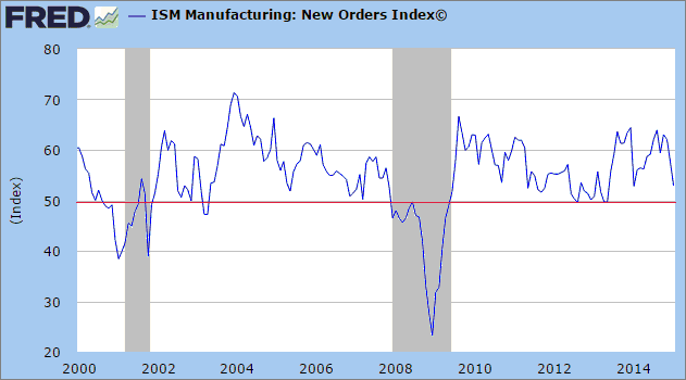
One of the few sets of economic data that
provides useful information about the current or future performance of the US
economy is the set of numbers published each month by the Institute of Supply
Management (ISM), and of the ISM's numbers the most useful is the New Orders
Index. The ISM numbers for January-2015 were published on Monday 2nd February.
The ISM New Orders Index has turned down and broken solidly below 50 ahead of
every US recession of the past 65 years. There were 11 official recessions
during that period. As a recession indicator it therefore hasn't generated any
false negatives. However, it does generate the occasional false positive,
meaning that there have been occasions when it broke solidly below 50 and a
recession did not soon follow. We count 9 such instances. The historical record
therefore suggests that when the ISM New Orders Index breaks solidly below 50
(to 48 or lower) there is a better than 50% probability that the US economy has
either just entered a recession or will enter a recession within the ensuing few
months.
The chart displayed below shows the performance of the ISM New Orders Index
since 2000. Notice that the Index broke below 50 just ahead of the 2001 and
2007-2009 recessions, that there was a 'false positive' during the first half of
2003, and that the economy only barely managed to avoid entering recession
territory during 2012 and the first half of 2013. Also notice that there has
been a sharp decline in the Index over the past two months, although it remains
above 50.
The moribund economic situation in Europe and elsewhere is weighing on the US
manufacturing sector, but there are signs that economic activity* is about to
pick up in Europe. We are referring to the recent acceleration in the pace of
euro-zone monetary inflation and the upside breakouts in European stock indices.
Consequently, we won't assume that the decline in the New Orders Index will
continue. Instead, we'll wait for a break below 50 before starting to anticipate
an imminent recession.
Unlike the ISM New Orders Index, which always breaks out to the downside just
prior to a recession but occasionally warns of a recession that never
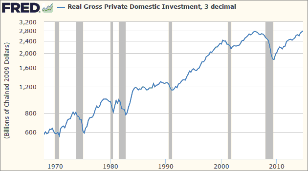
eventuates, the following chart shows a leading indicator of US recession that
has never generated any false positive or false negative signals. It has always
reversed its trend from up to down in advance of a US recession and has
otherwise never reversed its trend from up to down. We are referring to Real
Gross Private Domestic Investment (RGPDI).
The problem is that RGPDI only gets updated quarterly. For example, prior to
last week the most recent RGPDI data was for the September quarter of last year.
However, given the fact that it usually turns down at least 1-2 quarters prior
to the start of a recession it can still be useful as a leading indicator.
The data released last week showed that RGPDI made a new high in its post-2009
trend (a new all-time high, actually) during the December quarter, which means
that the next US recession is unlikely to start prior to the middle of this
year.
*Economic activity does not imply wealth-producing
activity. In particular, an increase in the rate of monetary inflation will
often cause economic activity to increase for a while, but much of the
inflation-fueled activity will be unproductive or counter-productive. In effect,
the false price signals caused by the monetary inflation prompt people to 'feast
on the seed corn'.The Stock Market
The US
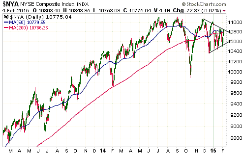
Over the past three months the NYSE Composite Index (NYA) has formed a
contracting triangle chart pattern via sequences of lower highs and higher lows.
It ended Tuesday's trading session at the top of the triangle and dutifully
reversed lower on Wednesday.
There is evidence that the US stock market is in the process of completing a
major top, but such a topping process would allow for a rally to a marginal new
high over the weeks ahead. That's why we don't have an opinion about whether the
NYA's eventual breakout from its contracting triangle, which should happen soon,
will be to the upside or the downside.
Europe
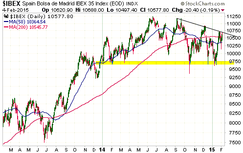
The senior euro-zone stock indices have recently broken out to new high
territory, but the less senior indices have generally not been as strong. An
example is Spain's IBEX 35 Index.
As illustrated by the following daily chart, the IBEX's price action over the
past 12 months could easily be interpreted as a rounded topping pattern with
critical support near 9700. Interestingly, the IBEX's situation looks similar to
the NYA's, with both having turned lower on Wednesday after touching resistance.
This price action doesn't lend itself to any conclusions about what the future
holds in store. There's no point pretending otherwise.
Gold and the Dollar
Gold
The gold market did very little over the first three trading days of this week.
It retains the potential to move up to test its recent highs (the low-$1300s)
over the days immediately ahead, but in the absence of a dramatic and unexpected
catalyst, such as a decision by Greece's new government to repudiate its debt,
it is unlikely to move significantly higher than that before resuming its
attempt to 'correct' a short-term 'overbought' condition in US$ terms and an
intermediate-term 'overbought' condition in non-US$ terms.
If there is a dramatic and unexpected gold-bullish catalyst within the next
several days, we suspect that the resultant gold surge would be limited by
intermediate-term resistance at $1350. In our opinion, a sustained break above
$1350 is unlikely within the next three months.
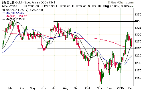
With regard to gold's near-term prospects, one possibility is that the US$ price
will remain between $1260 and the low-$1300s for long enough to enable the
50-day MA to rise to near the 200-day MA. Anticipation of the ensuing "Golden
Cross" would add to the bullish enthusiasm of the people who don't know what
moving-average crossovers mean (on a short-term basis they generally mean either
nothing or the opposite of what most people think) and set the scene for a
period of price weakness.
By the way, gold has been positively correlated with the Dollar Index since late
December, so no one should be surprised if the first few weeks of a downward
correction in the US$ coincide with weakness in the gold market.
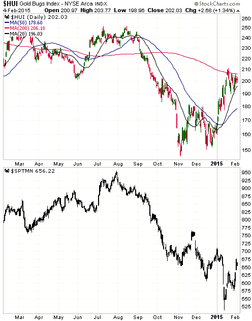
Gold Stocks
The HUI is continuing to oscillate between its 200-day MA on the upside and its
20-day MA on the downside (the red and black lines on the following chart), but
it will soon have to break out because the range is getting narrower by the day.
On Wednesday 4th February the 200-day MA dropped to 206 and the 20-day MA rose
to 196.
Although a rise to the 200-day MA is the most that can normally be expected from
the initial post-crash rally, it's certainly possible that the HUI will break
above this MA and move quickly up to the 220s before commencing a more
significant correction. Regardless of whether it has already begun or begins
after a quick gain of an additional 10% or so, the 50-day MA (the blue line on
the following chart) is a realistic target for the next correction low assuming
that a major trend reversal (from down to up) occurred last November.
Consequently, although short-term buying opportunities in individual gold stocks
will continue to crop up, the next sector-wide buying opportunity probably won't
arrive until the HUI drops to the vicinity of its 50-day MA.
The following daily chart compares the HUI, a gold mining index, with the SPTMN,
a general mining index. There are four points we want to make with the aid of
this chart.
First, the HUI and the SPTMN were trending downward together until
early-November, at which time they diverged. The HUI began to trend upward while
the SPTMN continued to trend downward.
Second, SPTMN's rapid decline to a new bear-market low during the first half of
January put some downward pressure on the HUI and temporarily prevented it from
reacting as strongly to the rise in the gold price as it would otherwise have
done.
Third, the rapid rise in the SPTMN over the past week helped support the HUI in
the face of gold-price weakness.
Fourth, IF the HUI's November-2014 upward reversal was either the
intermediate-term or long-term variety, then it is reasonable to expect that the
SPTMN will experience a similar upward reversal during the first half of this
year.
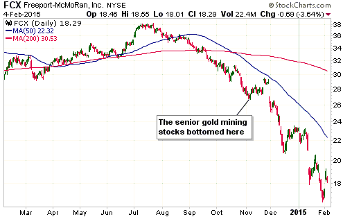
The XAU has lagged the HUI since the early-November bottom. The main reason is
that Freeport McMoran (FCX), a copper producer, is one of the XAU's largest
components. As evidenced by the chart displayed below, FCX has lost about
one-third of its market value since the gold-mining sector bottomed last
November.
Why does the XAU, a gold and silver mining index, have a copper producer as one
of its largest components? We have no idea. It makes no sense.
The Currency Market
The news flow, the latest being the ECB's decision that banks can no longer use
Greek government debt as collateral for loans, generally continues to be
euro-bearish and therefore supportive of the Dollar Index. As a consequence,
although the Dollar Index has pulled back over the past 8 trading days and
remains almost as stretched to the upside as it ever gets, we can't be sure that
a short-term top is in place. There's a high probability that the Dollar Index
will trade at a significantly lower level within the next month, but it could
first rise to test or marginally exceed its January peak.
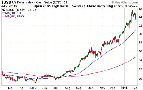
It has become clear that when the Swiss National Bank (SNB) eliminated the Swiss
Franc's peg to the euro in mid-January, it did not take a step in the direction
of sounder monetary policy. For starters, at the same time as it eliminated the
peg it pushed interest rates further into negative territory. For seconds,
exchange-rate manipulation involving balance-sheet expansion and monetary
inflation resumed almost immediately. As a result of this intervention, more
than half of the gains achieved by the SF on the day the peg removal was
announced have already been given back.
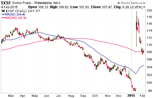
The SNB now has the flexibility to intervene whenever it feels like it, rather
than when it is forced to intervene to defend an arbitrary SF-euro exchange
rate. This, it seems, was the primary motivation for removing the peg.
Updates
on Stock Selections
Notes: 1) To review the complete list of current TSI stock selections, logon at
http://www.speculative-investor.com/new/market_logon.asp
and then click on "Stock Selections" in the menu. When at the Stock
Selections page, click on a stock's symbol to bring-up an archive of
our comments on the stock in question. 2) The Small Stock Watch List is
located at http://www.speculative-investor.com/new/smallstockwatch.html
Chart Sources
Charts appearing in today's commentary
are courtesy of:
http://stockcharts.com/index.html
http://research.stlouisfed.org/

|
