|
-- for the Week Commencing 15th April 2002
Forecast
Summary
 The
Latest Forecast Summary (no change from last week) The
Latest Forecast Summary (no change from last week)
Big Picture
View
Here is a summary of our big picture
view of the markets. Note that our short-term views may differ from our
big picture view.
Bond yields (long-term interest
rates) will move higher during 2002.
The US stock market will make
new bear market lows in 2002.
The Dollar commenced a bear
market in July 2001, but will rally to a secondary peak during the first
half of 2002 before beginning a major descent.
A bull market in gold stocks
commenced in November 2000 and is likely to extend into 2003.
Commodity prices, as represented
by the CRB Index, will rally during 2002 and 2003.
The oil price will resume its
major uptrend during the first half of 2002.
Considerable
Slack
"Inflation declined during the recession
and seems poised to decline further as growth accelerates in an economy
with considerable slack," he [Dallas Federal Reserve Bank President
Robert McTeer] said in the Dallas Fed's annual report.
The above really is an incredible statement
from the president of the Dallas Federal Reserve Bank. There was apparently
so little slack in the economy during 1999 that the Fed felt compelled
to raise short-term interest rates a number of times, yet today, with consumer
spending and the overall level of indebtedness having grown considerably
over the past 3 years, the economy supposedly has "considerable slack".
We wouldn't argue that there is considerable slack in those few sectors
of the economy where capacity was expanded at a phenomenal rate during
the Fed-sponsored NASDAQ bubble (eg, the telecom industry), but the absence
of "slack" that led to an energy crisis during 2000-2001 has certainly
not been addressed.
The 'lack of slack' in the US economy
is evidenced by the surge in energy prices over the past 5 months despite
the continuing strength of the US$ (only the recent gains were Middle East
related). It is also evidenced by the behaviour of the bond market.
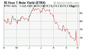
Below is a chart showing the yield
on the 10-year T-Note during the 6-month period following the 1990-1991
recession. At the end of a recession there is typically a lot of 'slack'
in the economy and this 'slack' enables long-term interest rates to fall
during the initial stages of recovery. This is what happened after the
early-90s recession.
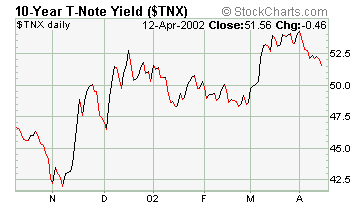
Below is a chart showing the yield
on the 10-year T-Note over the past 6 months. If there really was "considerable
slack" in the economy and inflation really was "poised to decline further"
then interest rates would still be trending lower. That is clearly not
the case.
When McTeer uses the word inflation
he is referring to an increase in the CPI. If we define inflation correctly
(as an increase in the supply of money) then the current US inflation rate
is 9.1%. This inflation will eventually put upward pressure on some prices,
although anyone who truly believes that the CPI accurately represents cost
of living changes, or is even an honest attempt to accurately represent
cost of living changes, deserves a gullibility award. Ironically, if we
define our terms correctly then McTeer's statement that inflation is "poised
to decline further" is actually true since the money supply growth rate
is poised to decline further.
Commodities
At the beginning of this year we forecast
that commodity prices, as represented by the CRB Index, would perform well
in 2002 relative to the stock market (as represented by the S&P500
Index). Our concern at the time, however, was that the CRB Index would
out-perform the S&P500 Index and still not yield a good absolute return.
This concern was based on the positive correlation between the CRB and
the S&P500 that had been evident over the past 2 years.
Below is a chart comparing the S&P500
and the CRB Index. Since mid-2000 the CRB Index has followed the S&P500
with a lag of 0-6 weeks. At some point we expect this relationship to breakdown
and for commodity prices to start trending higher as stock prices trade
sideways. It is quite possible, however, that a major rally in commodity
prices will have to wait until after the stock market has reached its ultimate
low (the stock market's ultimate low is expected to occur late this year).
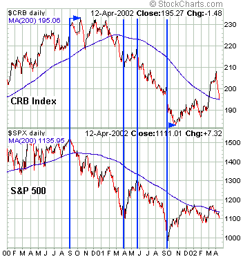
The CRB Index has fallen sharply over
the past 2 weeks but has not yet closed below its 200-day moving-average.
Also, the stocks of commodity producers have held up quite well despite
the recent weakness in the stock market and commodity prices. As such we
are treating the recent decline as a bull market pullback but may need
to ramp-down our expectations for commodity prices if the CRB Index continues
to move with the S&P500.
The US
Stock Market
Small caps versus large caps
The upward trend in the NYSE's advance-decline
line is often cited as a reason to be bullish. The advance-decline line's
upward mobility stems primarily from the strength in small-cap stocks which,
in turn, is also regularly cited as a reason to be bullish.
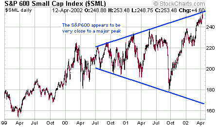
It is easy to be bullish at the top
and today's fervent enthusiasm for small cap stocks may be a sign that
this sector of the market is close to a peak. The following chart of the
S&P600 Index (an index of small cap stocks) certainly suggests that
this might be the case. This is a close-up view of the chart we showed
a couple of weeks ago to illustrate the broadening top (a sequence of higher
highs and lower lows) that appears to be forming. The chart suggests that
the downside risk in this popular sector of the market now vastly outweighs
the upside risk.
Whereas small-cap stocks appear to
be nearing an important peak, large-cap stocks reached a 'bubble peak'
back in 2000 and have been working their way lower ever since. Furthermore,
the decline in large-cap stocks looks like it still has much further to
go.
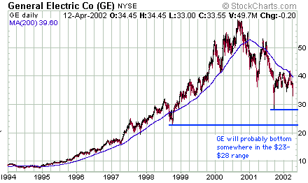
Below is an 8-year chart of General
Electric, the largest of the large-caps. GE peaked during the third quarter
of 2000, making it one of the last of the large-caps to do so. Last week's
drop in the GE stock price on the back of disappointing earnings news suggests
that the next phase of the stock's major downtrend has begun.
Current Market Situation
It is almost time to move to the bullish
side of the fence as far as the short-term is concerned. Here's why:
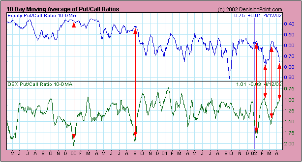
1. As indicated by the following chart,
the 10-DMA of the equity put/call ratio has moved up to a high level (telling
us that option traders are, as a group, fearful). Note that the chart scale
is reversed so that the line falls as the put/call ratio rises. Furthermore,
there is a pronounced divergence between the equity put/call ratio and
the OEX (S&P100 Index) put/call ratio. As mentioned in the past, the
equity put/call ratio is a good contrary indicator (meaning that equity-options
traders, as a group, are invariably caught leaning the wrong way at important
turning points) while the OEX put/call ratio is not a good contrary indicator
(OEX-options traders tend to be right as often as they are wrong). In fact,
it is usually worth paying attention when the equity put/call ratio is
at one extreme while the OEX put/call ratio is at the opposite extreme,
as is currently the case. When these large divergences occur the OEX traders
are almost always correct. The OEX-options traders have just taken a bullish
stance while the equity-options traders have taken a decisively bearish
stance.
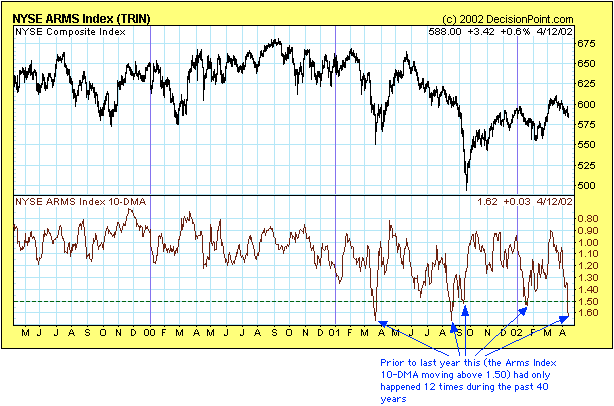
2. The Arms Index 10-DMA has just hit
one of its highest levels of the past 40 years. High Arms Index readings
occur when declining volume on the NYSE is high relative to the number
of stocks that are declining, that is, they occur when most of the selling
pressure is concentrated in a relatively small number of stocks.
3. The June bond futures have rallied
and have now built a 4-point cushion between their current level and their
December low. A further gain of another point or so is all we can reasonably
expect from this bear market rally, but the immediate danger of a collapse
in bonds has been removed.
It is almost time to turn bullish,
but it is not yet time. While the high Arms Index reading tells
us that a substantial rally is likely to begin during the next few weeks,
the rally could begin from a MUCH lower level. For example, the extreme
Arms Index reading during the second half of August last year was followed
by a 20% plunge in the NYSE Composite Index over the ensuing 4 weeks. Unless
we get the emotional equivalent of September-11 a 20% plunge from current
levels over the next 4 weeks won't occur, but a drop of another 5%-10%
is certainly possible.
Three other reasons to remain very
cautious at this time are:
1. The Japanese stock market remains
in a short-term downtrend.
2. The large commercial traders have
not yet begun to cover their huge short position. In other words, the smart
money is betting on a further decline.
3. Volatility remains at a very low
level. Low volatility is not, in itself, a concern since volatility could
increase from its low levels via either a sharp rally or a sharp decline.
However, a sharp rally is not likely going to begin with the commercials
net-short to the tune of 91,000 contracts.
We will continue to hold our June QQQ
put options for now, but an opportunity to close-out this bearish position
and move to a long position in the QQQ is likely to present itself during
the next few weeks.
Traders and investors should continue
to accumulate the stocks of commodity producers during weakness. These
stocks are likely to be amongst the leaders once the current decline runs
its course and a rally begins.
This week's important economic/market
events
| Date |
Description |
| Monday April 15 |
No significant events |
| Tuesday April 16 |
CPI
Industrial Production |
| Wednesday April 17 |
Trade Balance |
| Thursday April 18 |
Leading Economic Indicators |
| Friday April 19 |
No significant events |
Gold and
the Dollar
Platinum versus Gold
Although they are both precious metals
the prices of platinum and gold respond in very different ways to different
economic and monetary environments.
Below is a long-term chart of the platinum/gold
ratio. The chart was taken from http://www.cairns.net.au/~sharefin/Markets/Master.htm,
an excellent resource for financial market data. We've added notes and
lines to the chart to illustrate (labour?) the point we are about to make.
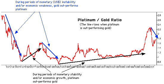
Platinum tends to out-perform gold
during prolonged periods of economic growth or perceived monetary stability
and to under-perform gold during prolonged periods when confidence in the
economy and the financial system is deteriorating. This relationship occurs
due to gold's status, a status that has developed over thousands of years,
as the ultimate form of money outside the financial system.
With reference to the above chart we
can see that the platinum/gold ratio plunged (the gold price rocketed higher
relative to the platinum price) during the early-1970s and bottomed, in
late-1974, at around the same time that the stock market was hitting its
major low. It is also apparent that the platinum/gold ratio trended higher
from 1982 through to 2000, reaching what looks like a bubble peak in late-2000
at around the same time that the stock market bubble began to lose air
at a rapid rate.
If the decline in the stock market
and real economic growth over the past 18 months represents nothing more
significant than an interruption to the 1990s' boom then the platinum/gold
ratio will move above its 2000 peak over the coming 2 years. However, if
we have just witnessed the end of an era characterised by, amongst other
things, growing confidence in government, central banks and the fiat money
system, then the year 2000 gave us a multi-decade peak in the platinum/gold
ratio.
Our analyses of all the financial markets
over the past few years strongly suggest that the level of confidence in
government and government-sponsored money made a secular peak in 2000 and
is now in a secular downtrend. As such, the downturn in the platinum/gold
ratio in late-2000 represents a major trend reversal.
The above chart shows that trends in
the platinum/gold ratio, once set in motion, tend to continue for at least
4 years. In other words, we should expect the gold price to trend higher
relative to the platinum price until at least the second half of 2004.
This means that although some exposure to platinum (via the stocks of platinum/palladium
producers) is desirable we should, based on the evidence at hand, continue
to substantially overweight gold relative to platinum in our investment
portfolios.
There are certainly going to be extended
periods over the next few years - periods when the prospects for economic
growth temporarily take a turn for the better - when platinum will out-perform
gold. However, the trend in the ratio is now DOWN and we will not be surprised
if gold trades higher than platinum at some point over the next 2-3 years.
The S&P500 in terms of gold
Below is another look at the S&P500/gold
ratio that we show from time to time. This chart suggests that a quick
move into the 320s by the gold price is still a distinct possibility before
an extended (2-3 month) correction gets underway. This is because the Wave
3 decline does not appear to be over, meaning that the prospect of a drop
to, or below, the September-21 low lives on. Assuming the S&P500 doesn't
completely fall out of bed the only way this can happen is via a surge
in the gold price.
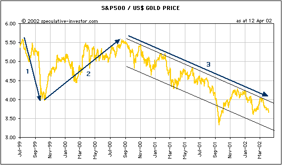
Last September's closing low for the
ratio was 3.32. If the S&P500 falls to 1070 (a reasonable short-term
objective) then an S&P500/gold ratio of 3.32 would require a gold price
of $322.
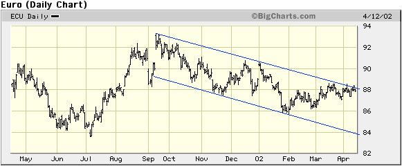
Current Market Situation
The euro is still unable to break its
downtrend, but this can't get any closer (see chart below). If we traded
currencies (we don't) we'd be more inclined to be short the euro than long
the euro at this time because the channel looks like it is going to hold
for now. However, we would quickly move to a long position following a
daily close of 88.40 or higher (basis the June futures).
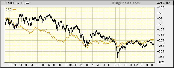
In the 8th April Weekly Update we mentioned
that the A$ looked vulnerable to a sharp fall. The A$ continues to trend
higher but the short-term downside risk remains high (longer-term we are
very bullish on the A$). The below chart shows one reason for our concern.
The chart shows percentage movements in the A$ and the S&P500 since
the beginning of 2000. Notice that the A$ and the S&P500 have moved
in the same direction throughout this period with the exception of a couple
of brief divergences. One such divergence has occurred over the past month
with the A$ moving higher as the S&P500 has moved lower. This divergence
will probably be closed and since we expect more downside in the S&P500
in the short-term we think it will be closed via a drop in the A$.
The Dollar Index is more likely to
move higher than lower over the next few weeks, but the downside risk is
greater than the upside risk. What we mean by this is that while a near-term
rally is likely we would expect such a rally to halt at, or below, the
low-120s (2%-3% above the current level), whereas a reasonable initial
downside target once the inevitable decline does get started is around
105 (11% below the current level).
Anglogold generated a bit of excitement
in the gold world over the past week when they announced that further steps
were being taken to reduce the extent of their gold price hedging. However,
unless Anglogold's senior executives are the world's worst traders the
hedge buy-backs would have already occurred when the announcement was made.
In other words, if your goal is to get the best possible price you don't
announce your intention to buy before you buy. As such, the direct effect
of Anglogold's buy-backs on the gold price would have been 'in the market'
before the announcement was made. What wasn't in the market was the psychological
effect of the news.
Anglogold's change of policy and Newmont's
takeover of NDY mean that 2 of the 4 largest forward-sellers of gold over
the past 10 years are no longer sources of downward pressure on the gold
price. The stock prices of the other two - Barrick Gold and Placer Dome
- will continue to under-perform until the managers of these companies
change their hedging policies or are replaced by those who will make the
necessary changes.
Our views on gold and gold stocks are
unchanged from those outlined over the past few weeks. While a move into
the 320s is possible in the short-term, the bearish traders' commitments
and recent speculative frenzy in gold stocks tell us that a medium-term
peak is forming. However, we expect to see much higher prices for gold/silver
bullion and our favourite gold/silver stocks during the second half of
this year.
The Middle East
http://www.debka.com/
is a good site to visit on a daily basis to keep up with the latest developments
in the Middle East.
Update
on Stock Selections
Now is not a good time to be buying
gold stocks, buy anyone who feels an irresistible urge to buy at this time
should steer clear of the major producers and focus on the small exploration
companies that still represent good value in terms of their market caps
relative to their in-ground resources. These stocks should hold up better
during the coming correction.
Although the SA gold stocks generally
sell at large discounts to their NA counterparts due to the perception
of political risk, in one important respect - earnings - they are far less
risky. When Harmony and Gold Fields report their first quarter earnings
we suspect that their current stock prices will seem fully justified.

|
